MAT Apartment
São Paulo, SP, Brasil

FACTS
- Area
- 500 m2
- Conclusion
- 2020
PROJECT
- Architecture
- Jacobsen Arquitetura
- Architecture team
- Paulo Jacobsen, Bernardo Jacobsen, Edgar Murata, Marcelo Vessoni, Marcela Siniauskas, Pedro Ramos, Marcela Guerreiro, Marina Budib, Paula Miele, Maria Caporale, Lucas Cunha
- Landscape design
- Rodrigo Oliveira
- Lighting design
- Maneco Quinderé
- Photos
- Fran Parente
Located in São Paulo, the MAT Apartment has a privileged view of the city. With 500 square meters and a circular floor-plan, this project sought to create greater integration between shared spaces, where a couple and their 3 children live.
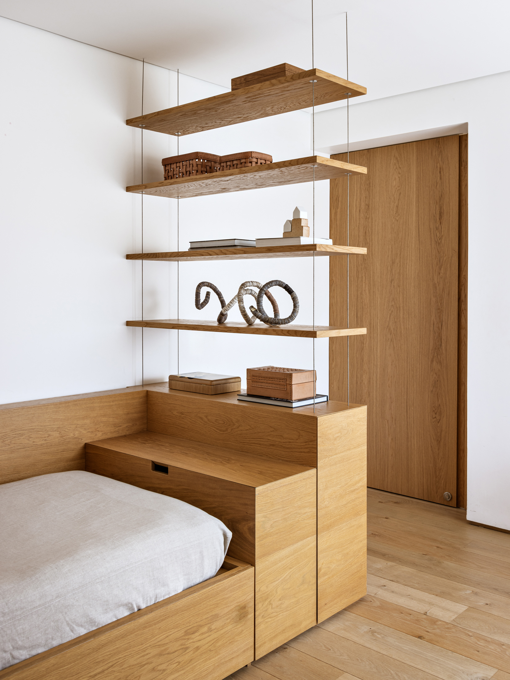
The project’s biggest challenge was finding the best way to work with its low ceilings. One of the solutions was to prioritize white as the main color of the apartment, with variations in lighter tones and wood, visually expanding the space. Furthermore, some cutouts were used in the ceiling, contouring the beams, which created a higher ceiling height in strategic points.
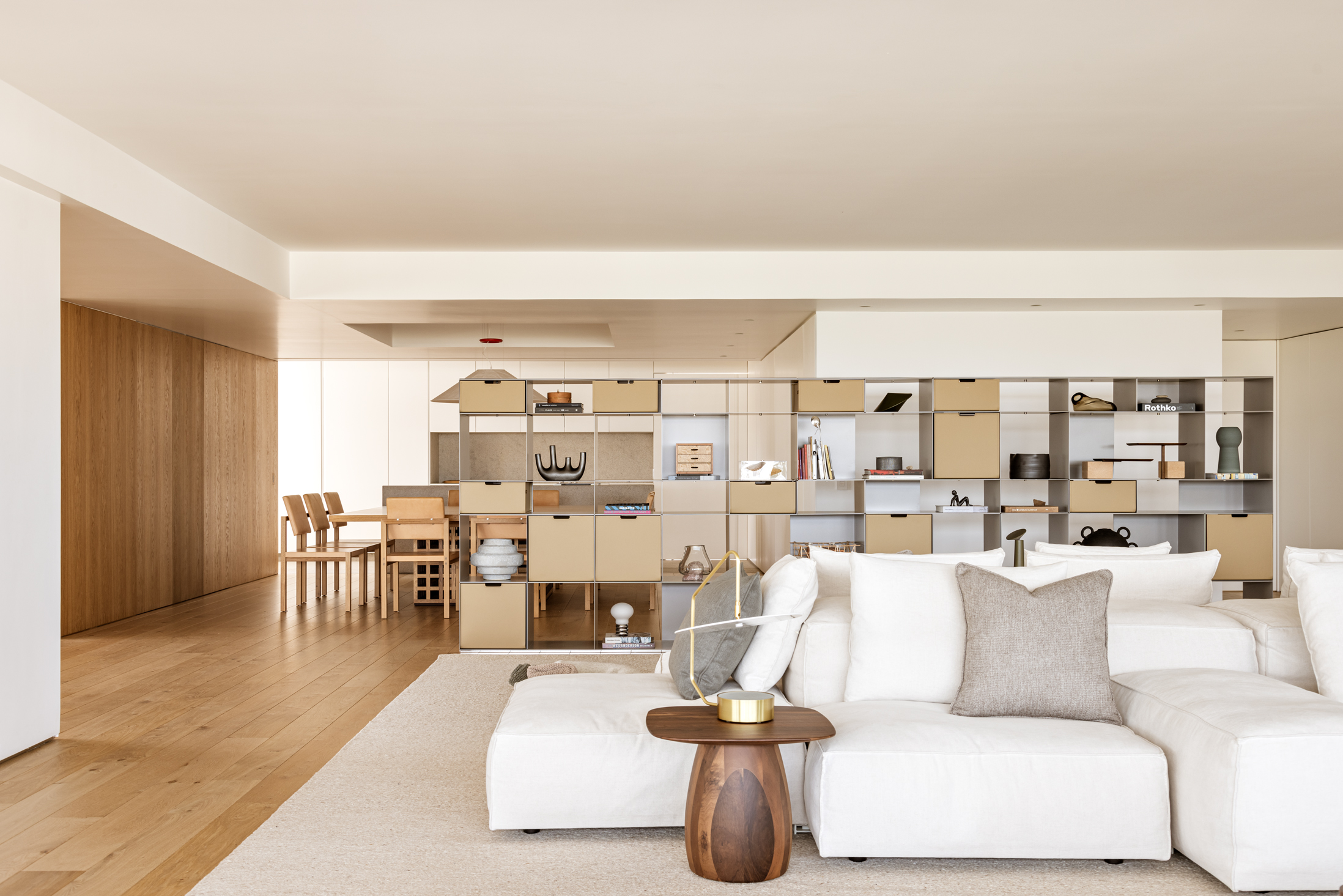
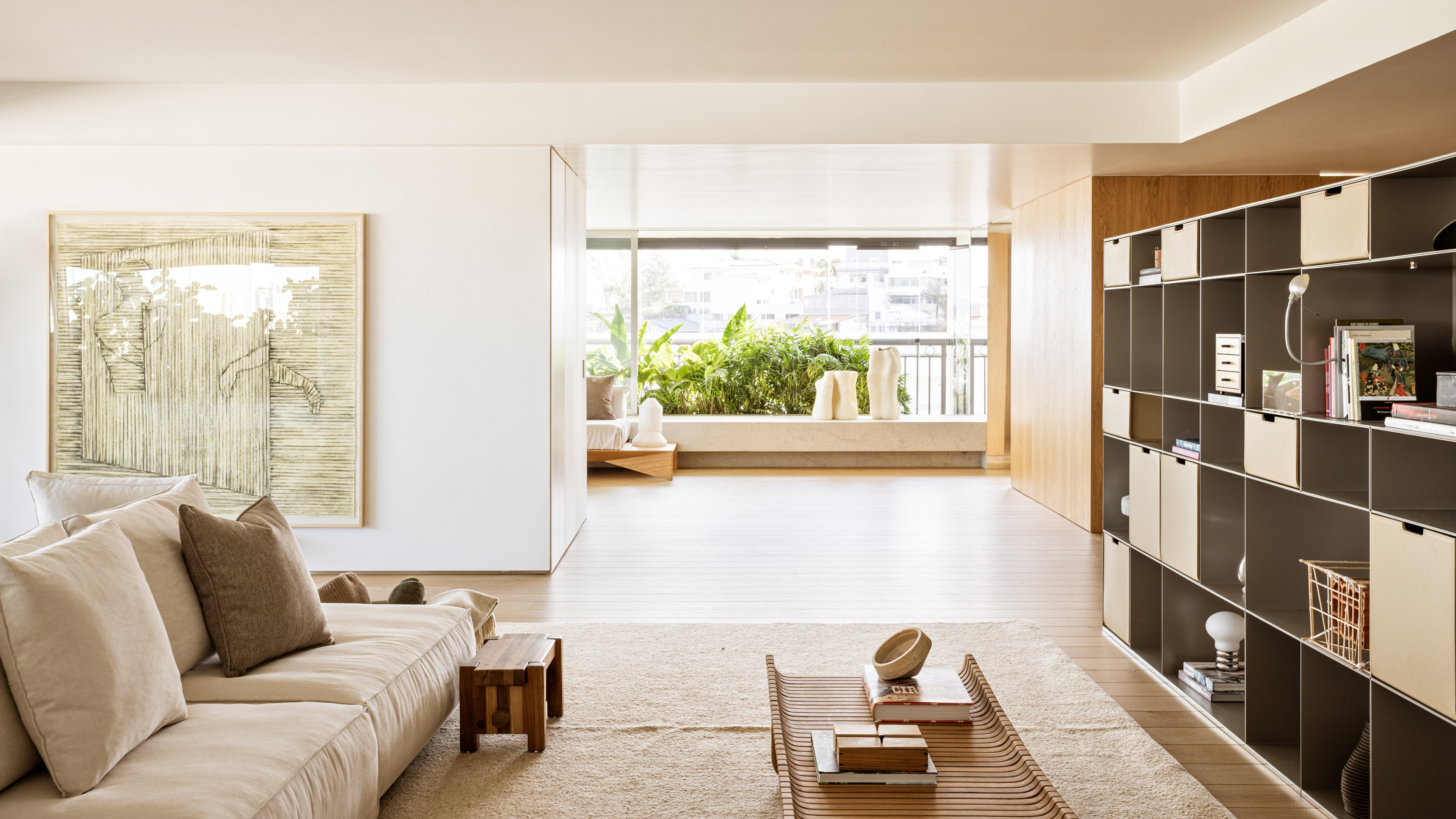
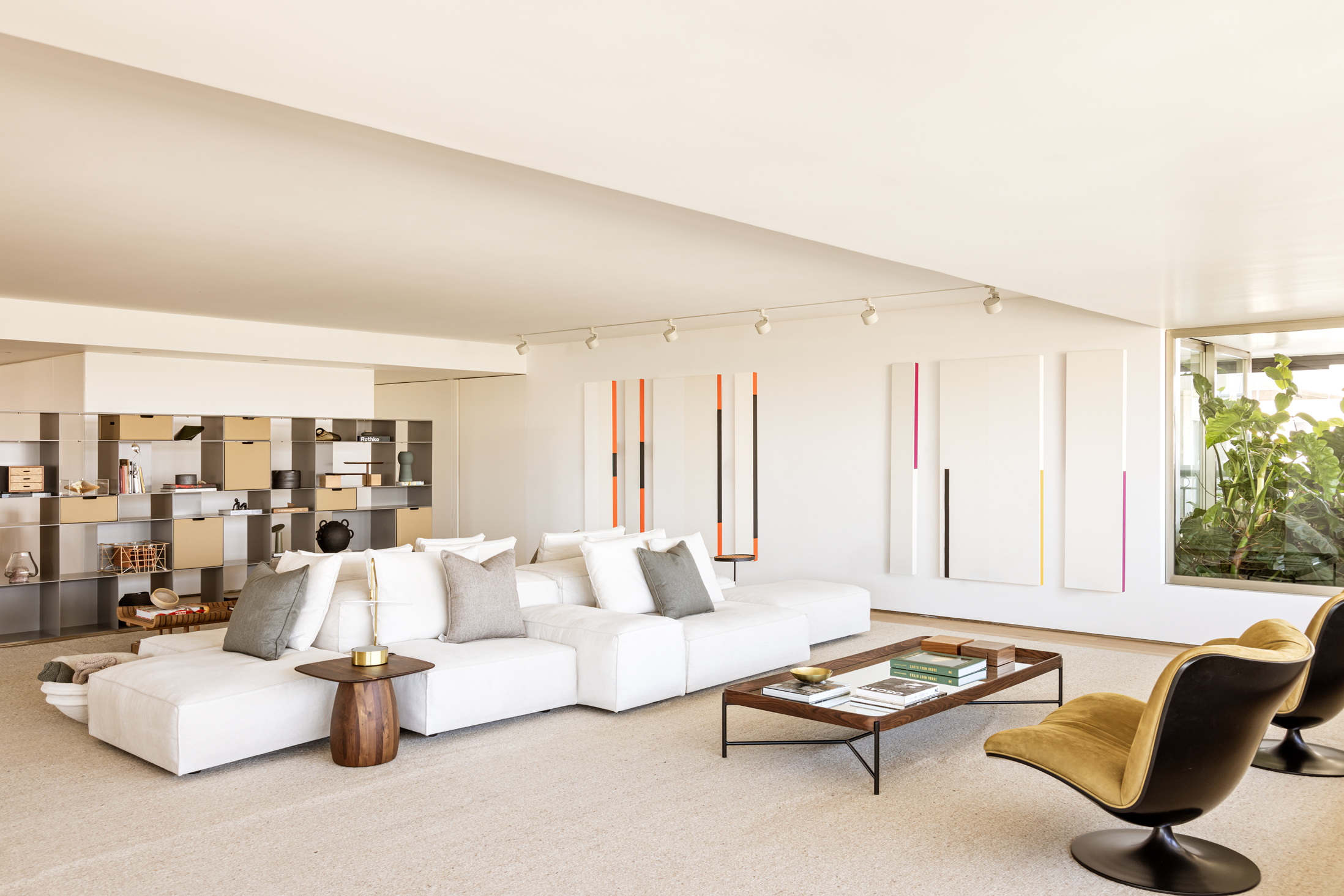
In the large common area are the living room, dining room and kitchen. The living room is divided by a white block, separating a more intimate area, with a home theater and fireplace, from a more social area, where a large sofa is the centerpiece.
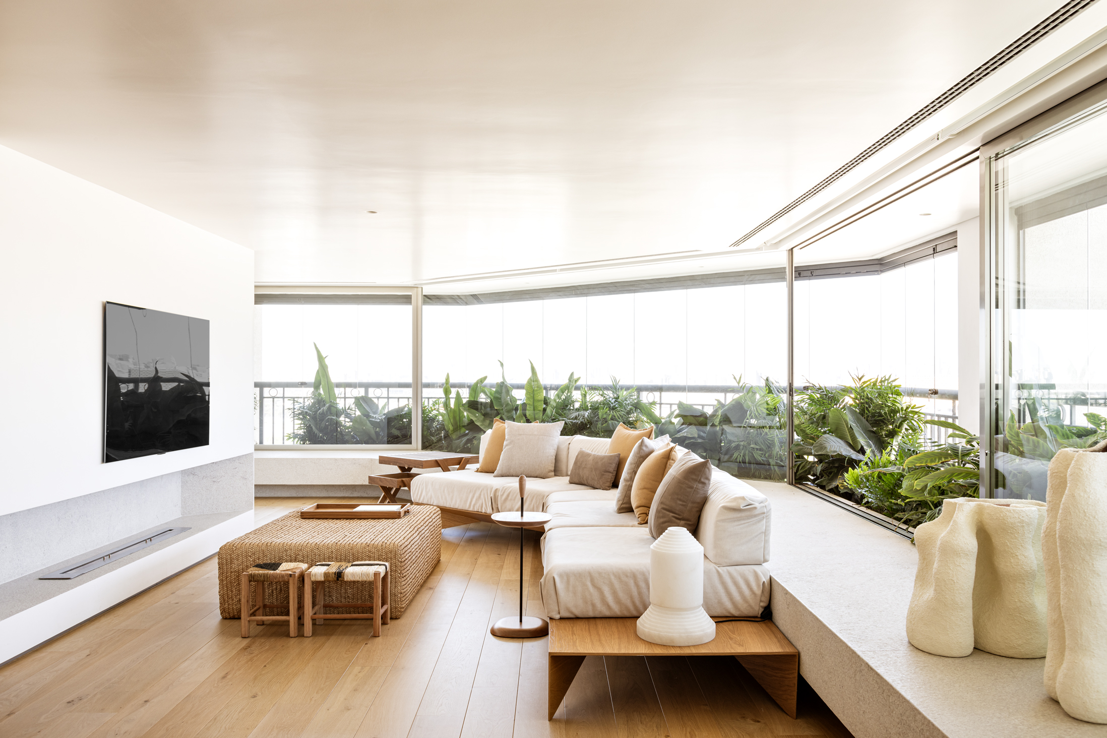
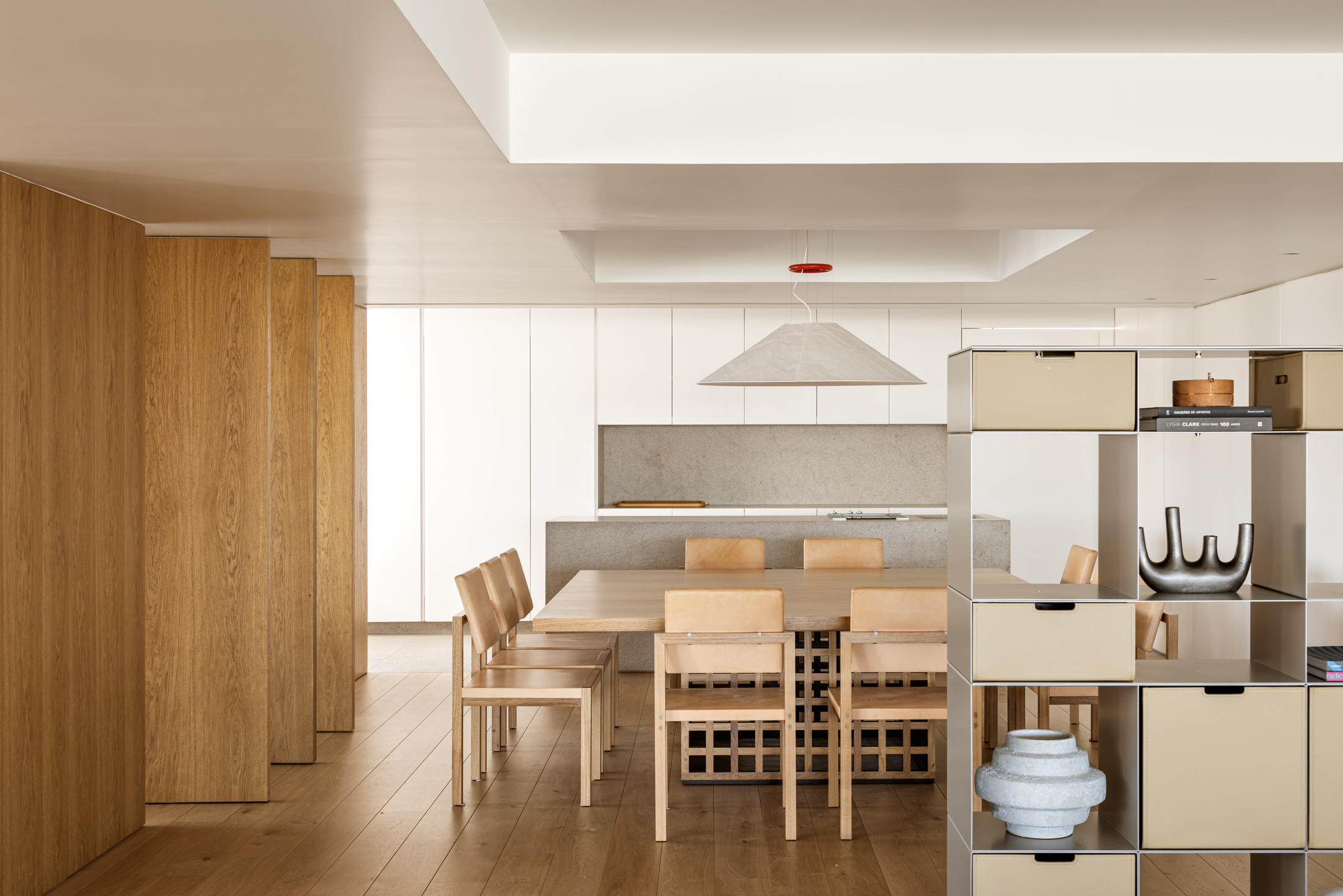
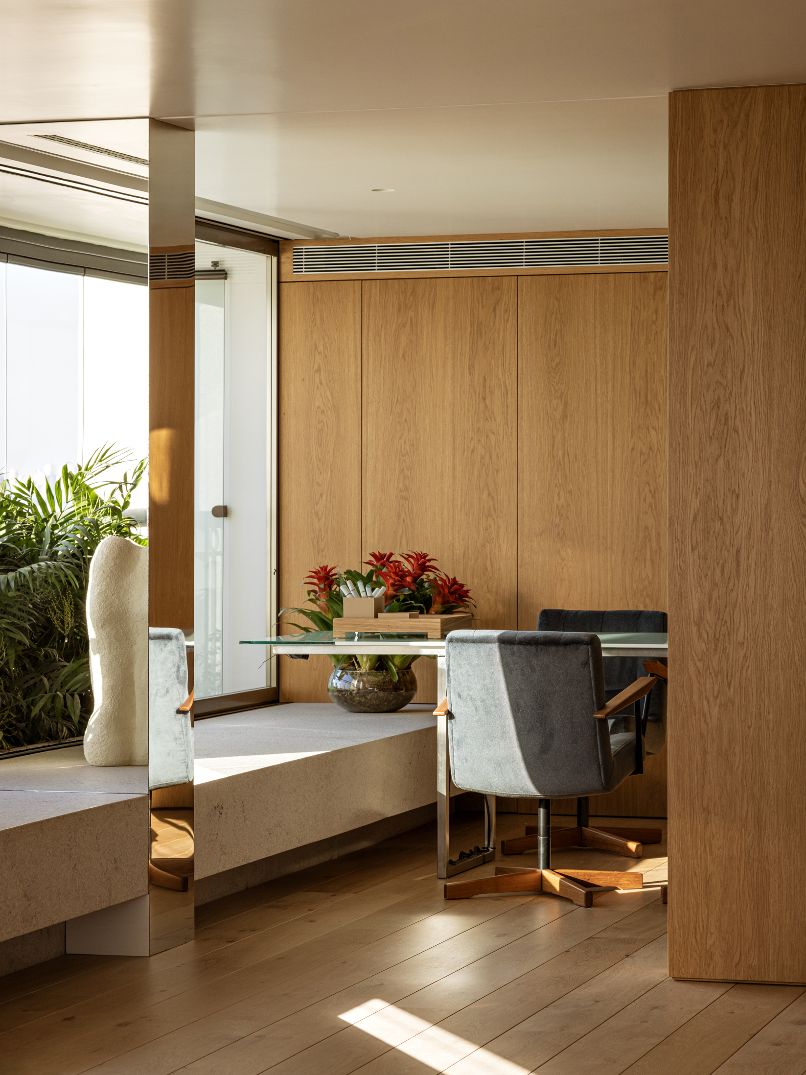
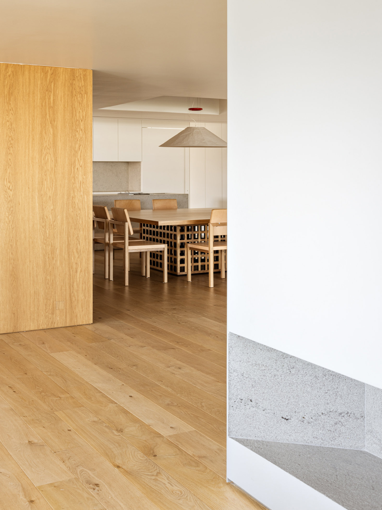
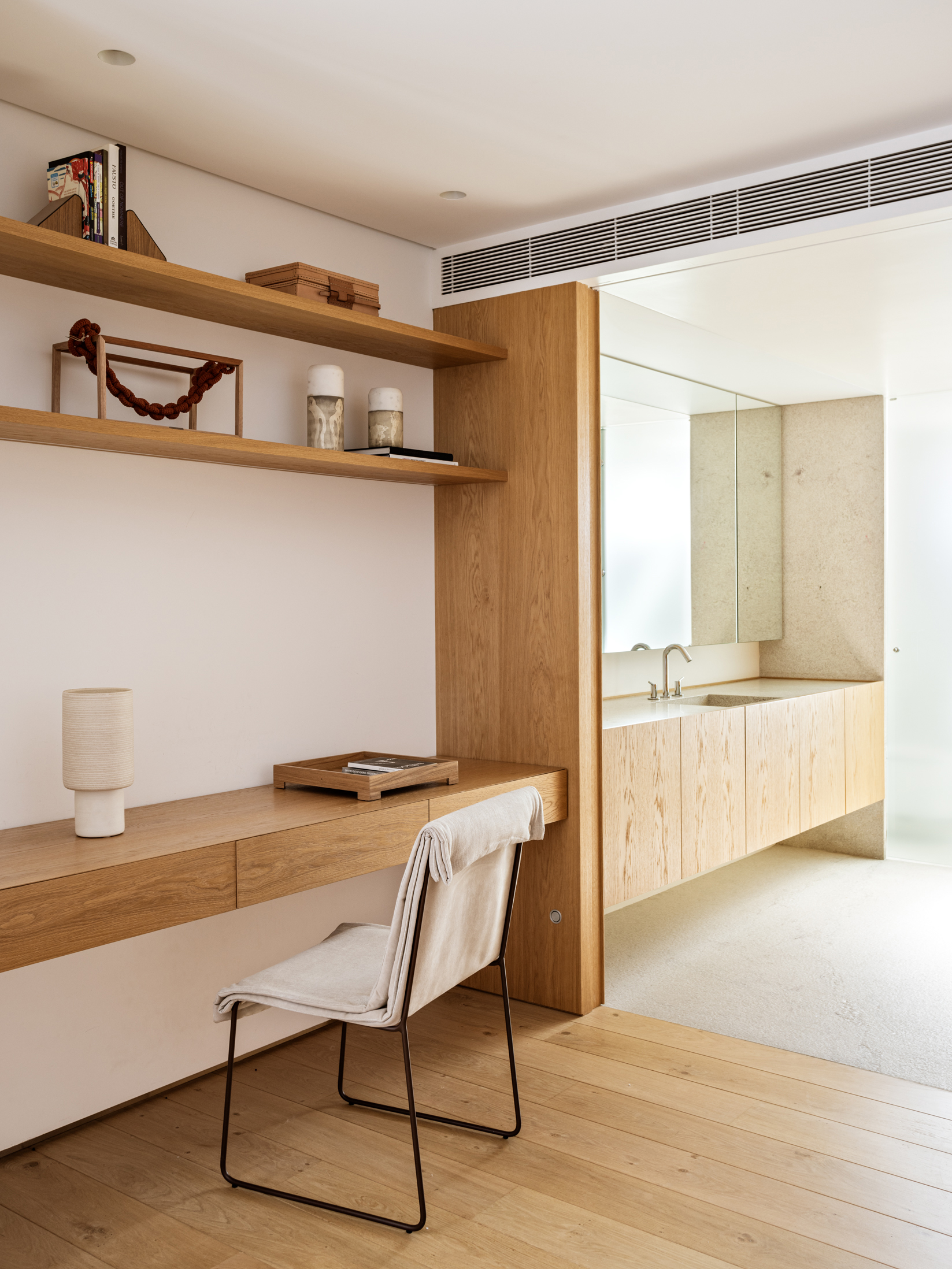
The dining room and kitchen are completely integrated and visually connected to the living room. An office, next to the dining room, is surrounded by a wooden enclosure that visually separates it from the rest of the space.
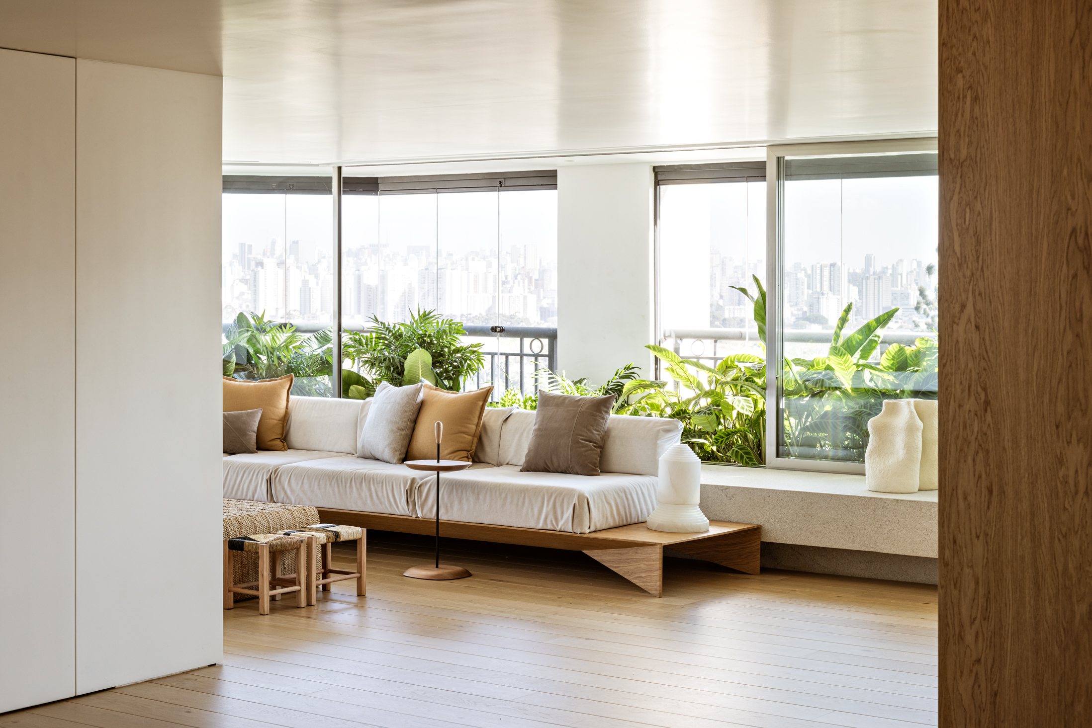
The sofa located in the family room is a variation of the PAPIR design, a collection with pieces designed exclusively for our projects.
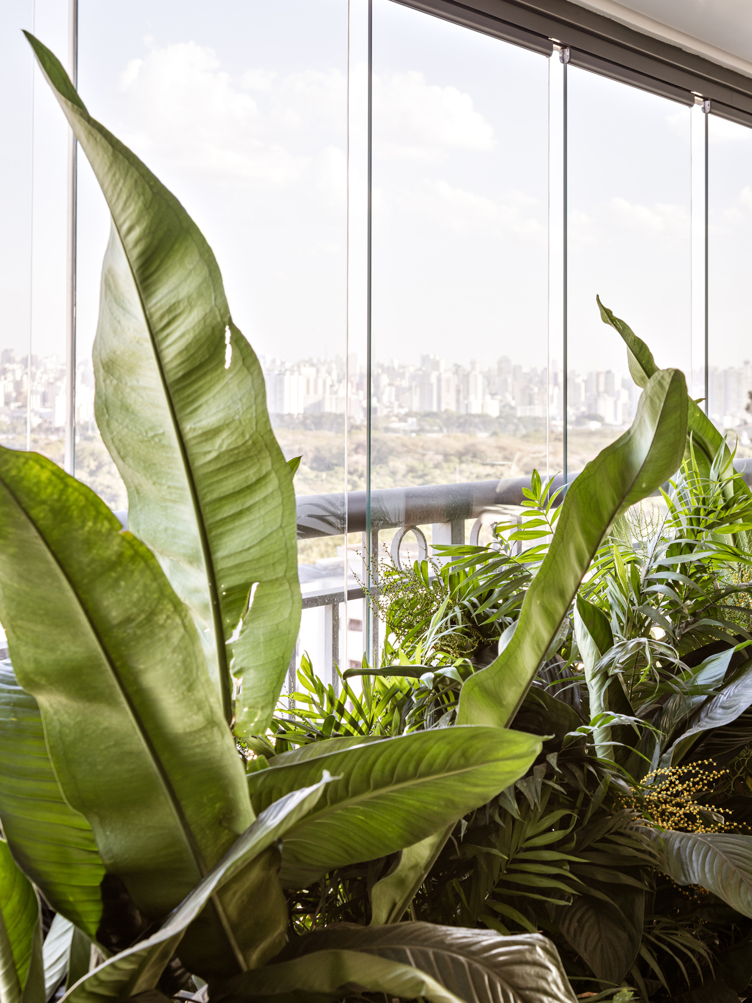
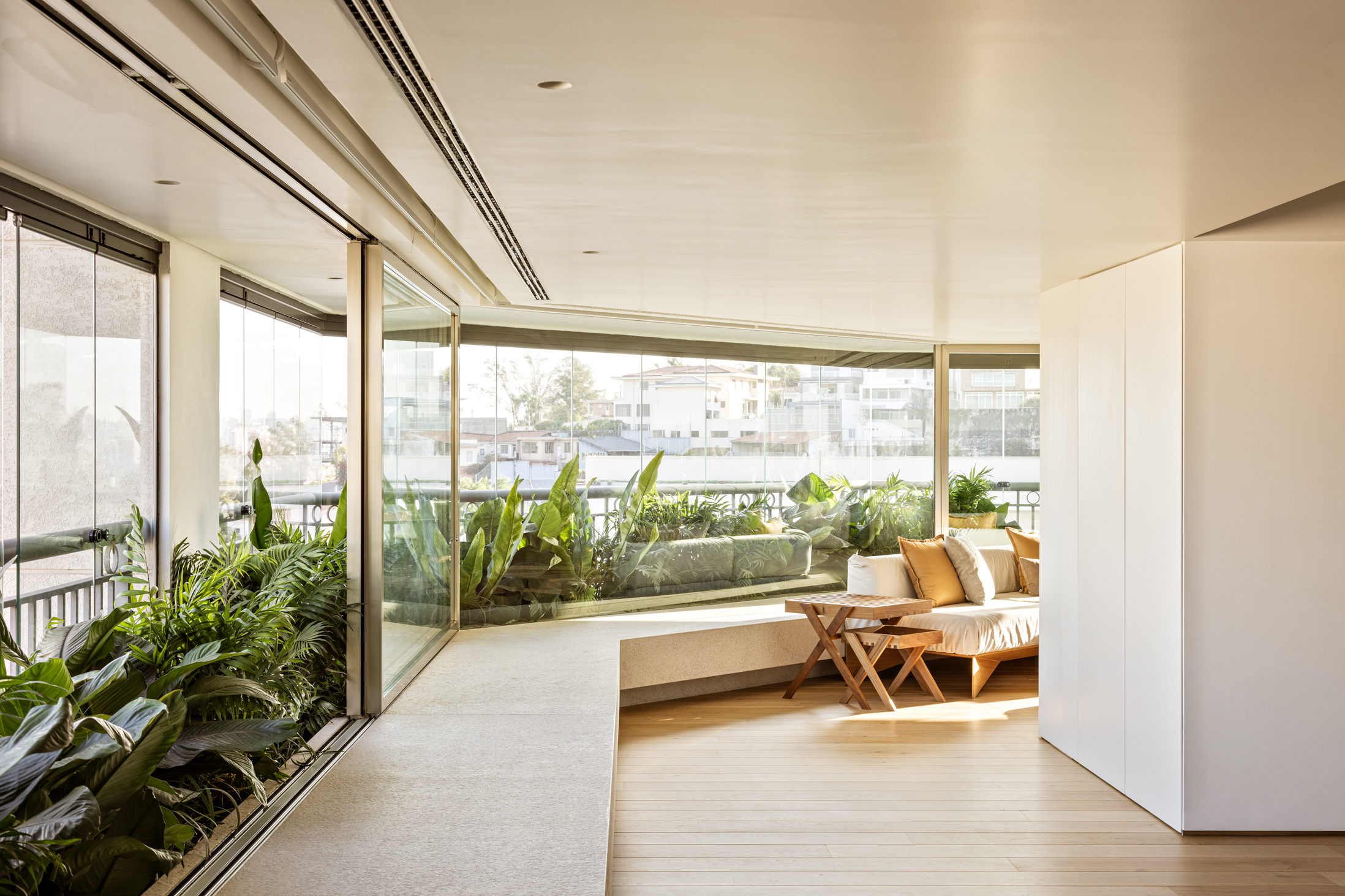
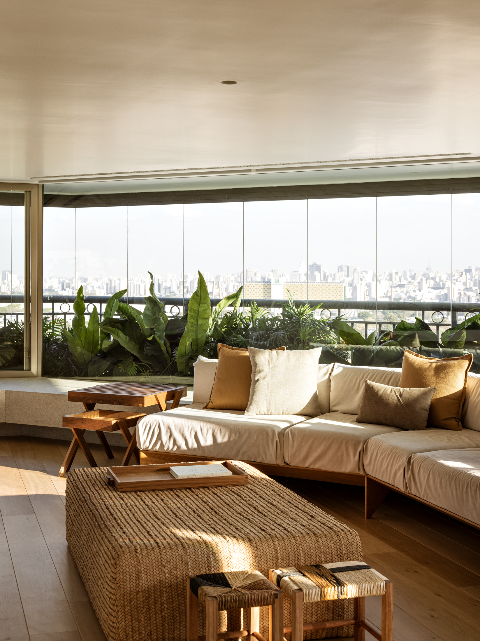
A long planter wraps around the entire perimeter of the balcony, increasing the homely feeling of the project. A long granite bench follows the path of the planter, on the inside, with different possible functions: support for decorative objects, furniture or even for resting. Because of the planter being recoiled, it was possible to use new and large frames, different from those required by the building.
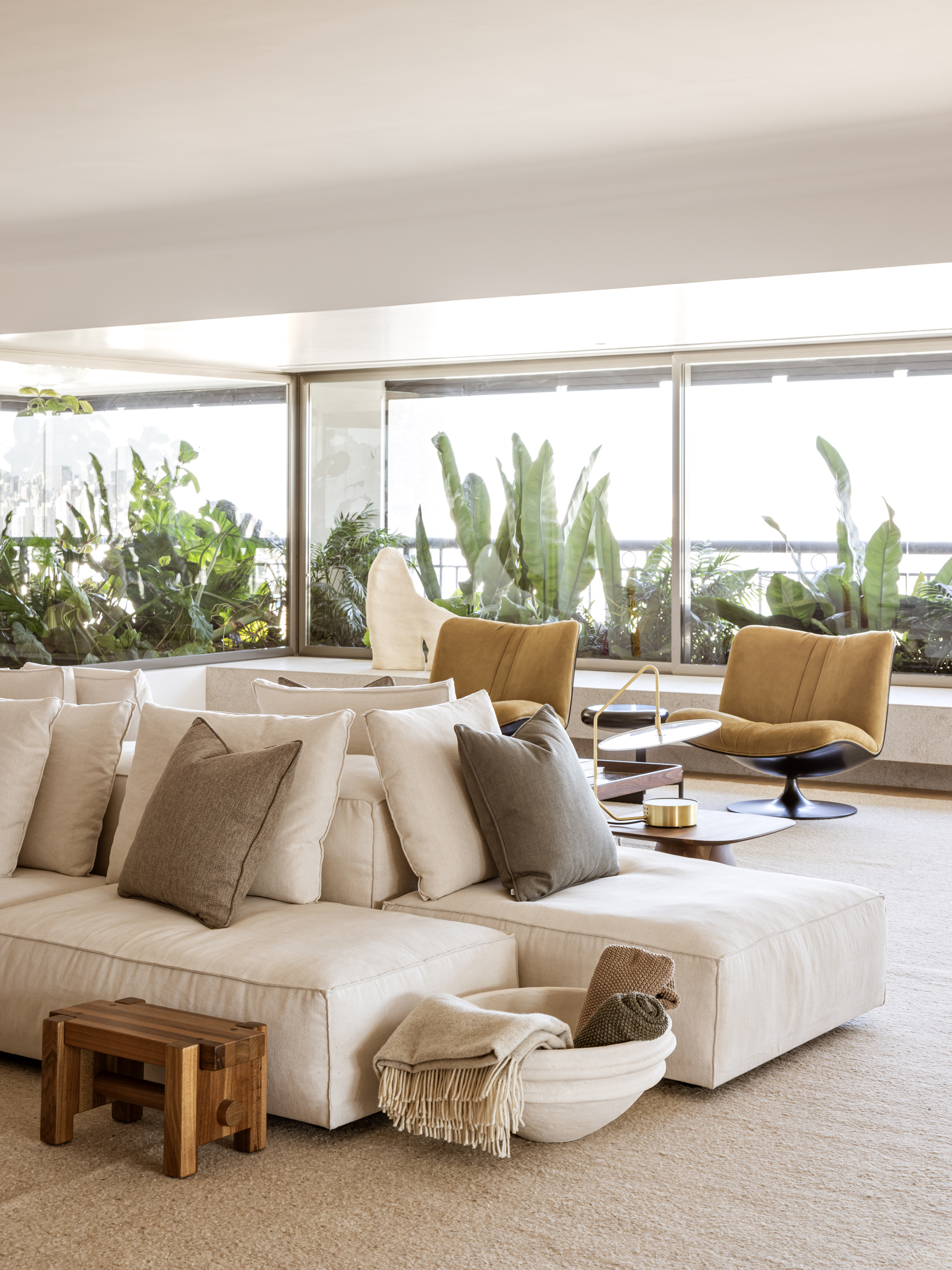
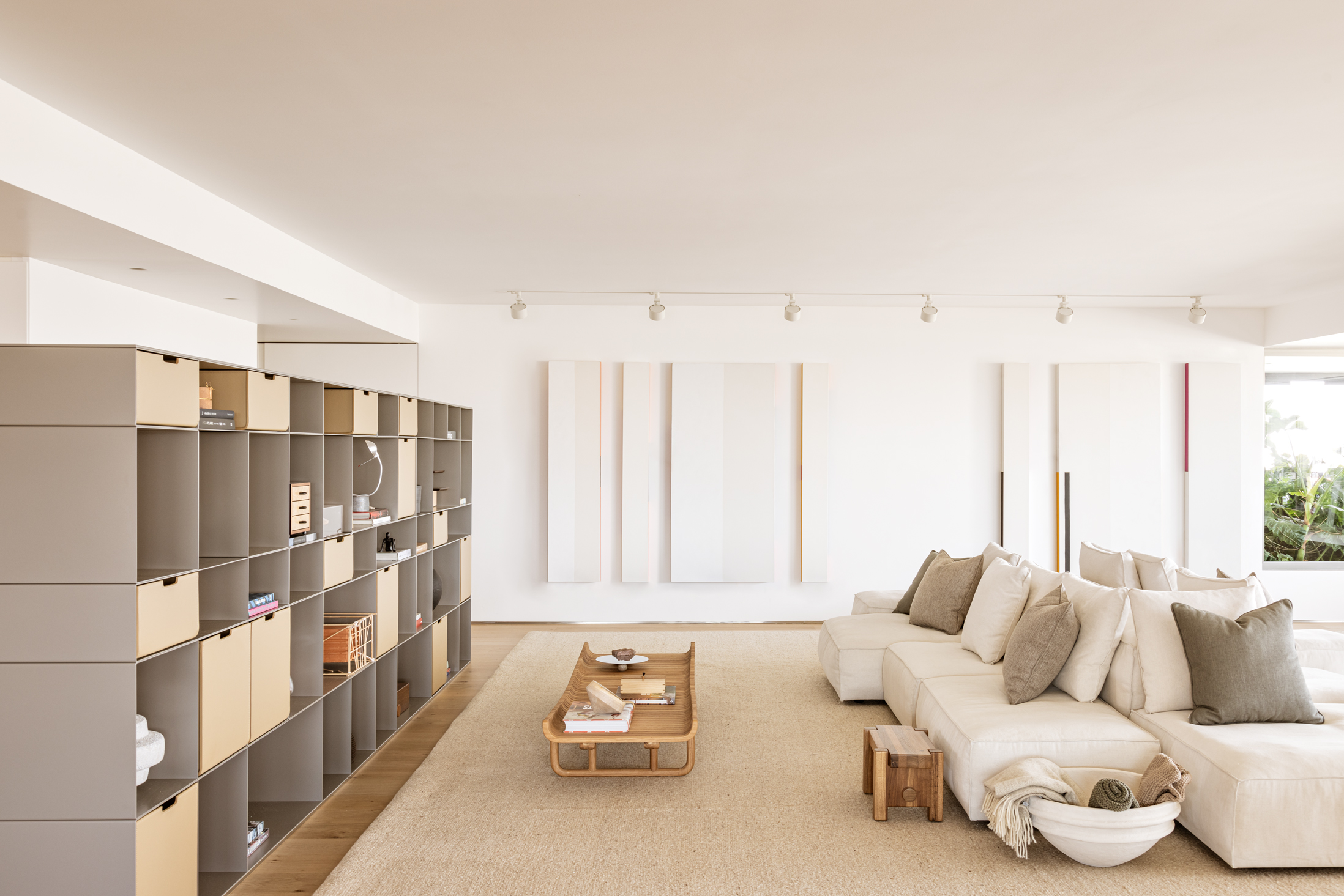
A minimum of carpets was used, in addition to the careful choice of fabrics for the furniture. Special spots were installed to highlight the works of art.
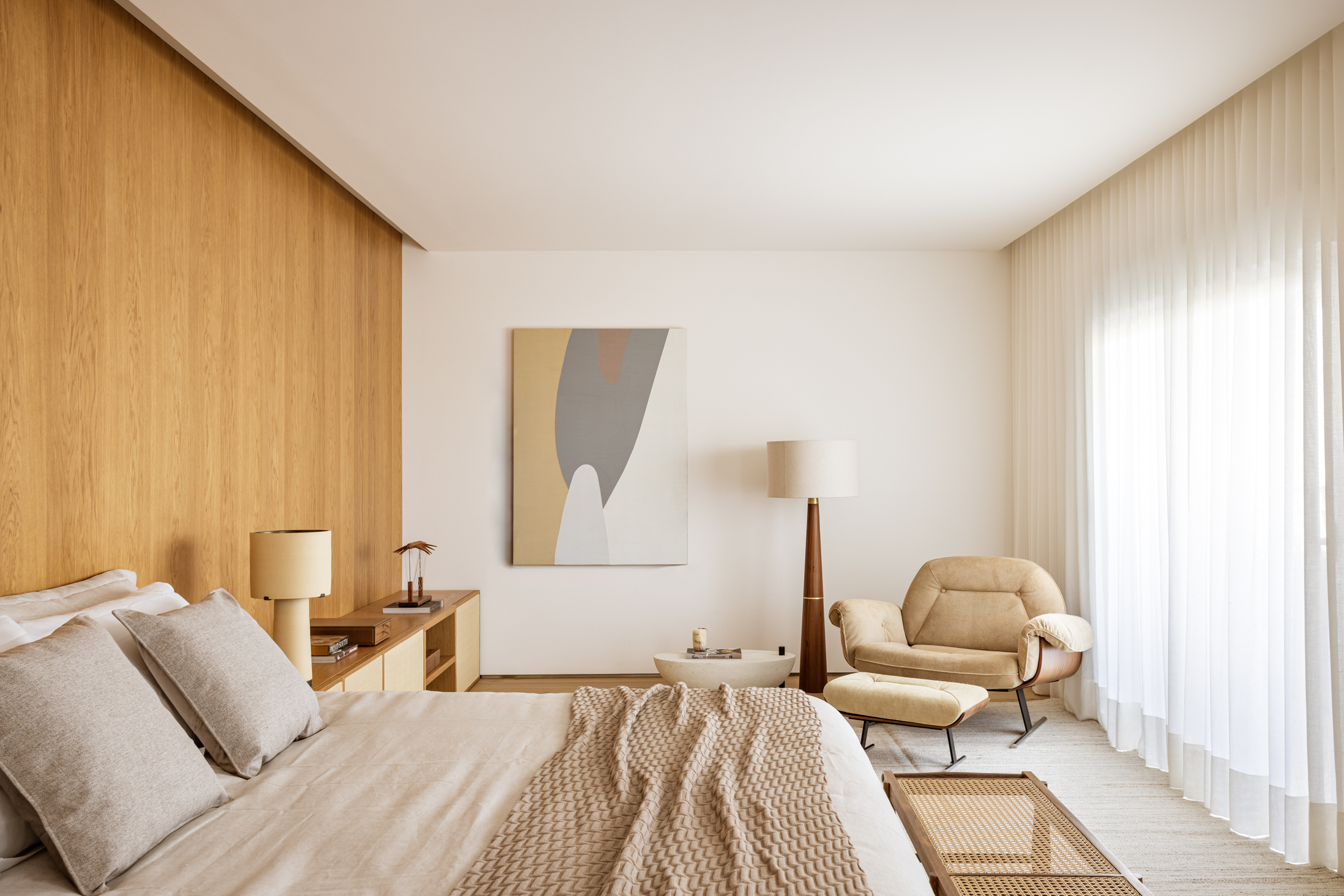
In the intimate area are located the couple’s master suite and the three children’s suites.
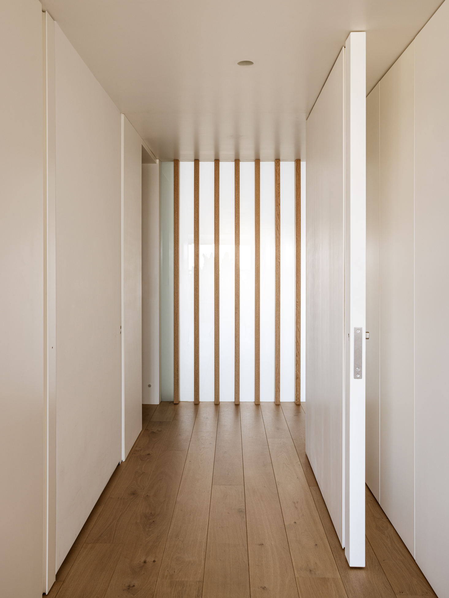
In the entrance hall, wooden brises with translucent openings were used, enabling a visual separation between the service area and the living room, while making the most of the light coming in.
