JE House + Extension
São Paulo

Facts
- Total Area
- 2.452,60m²
- Built Area
- 2.252,60m²
- Conclusion
- 2016
Project
- Office
- Jacobsen Arquitetura
- Office's Team
- Paulo Jacobsen, Bernardo Jacobsen, Edgar Murata, Marcelo Vessoni, Veridiana Ruzzante, Christian Rojas, Jaime Cunha Jr, Henrique Vetro, Rodrigo Oliveira
- Interior Design
- Jacobsen Arquitetura
- Interior's Team
- Tatiana Kamogawa, Caroline Oliveira, Mariana Ferretti
- Photos
- Léo Finotti
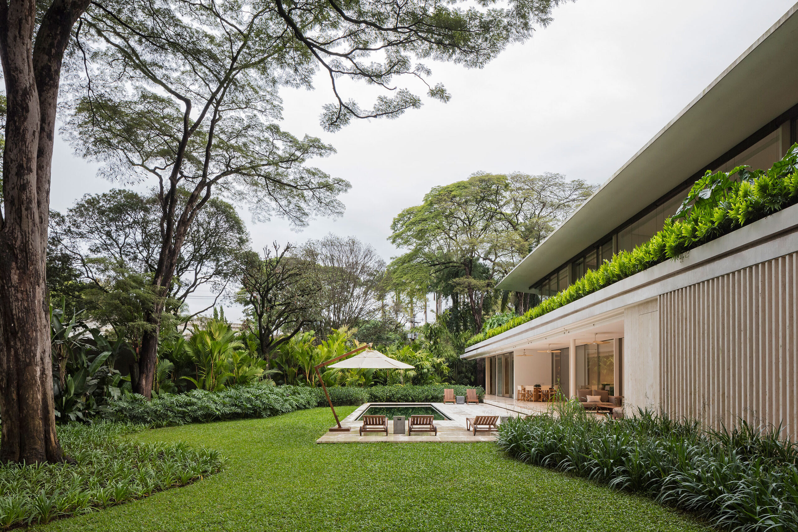
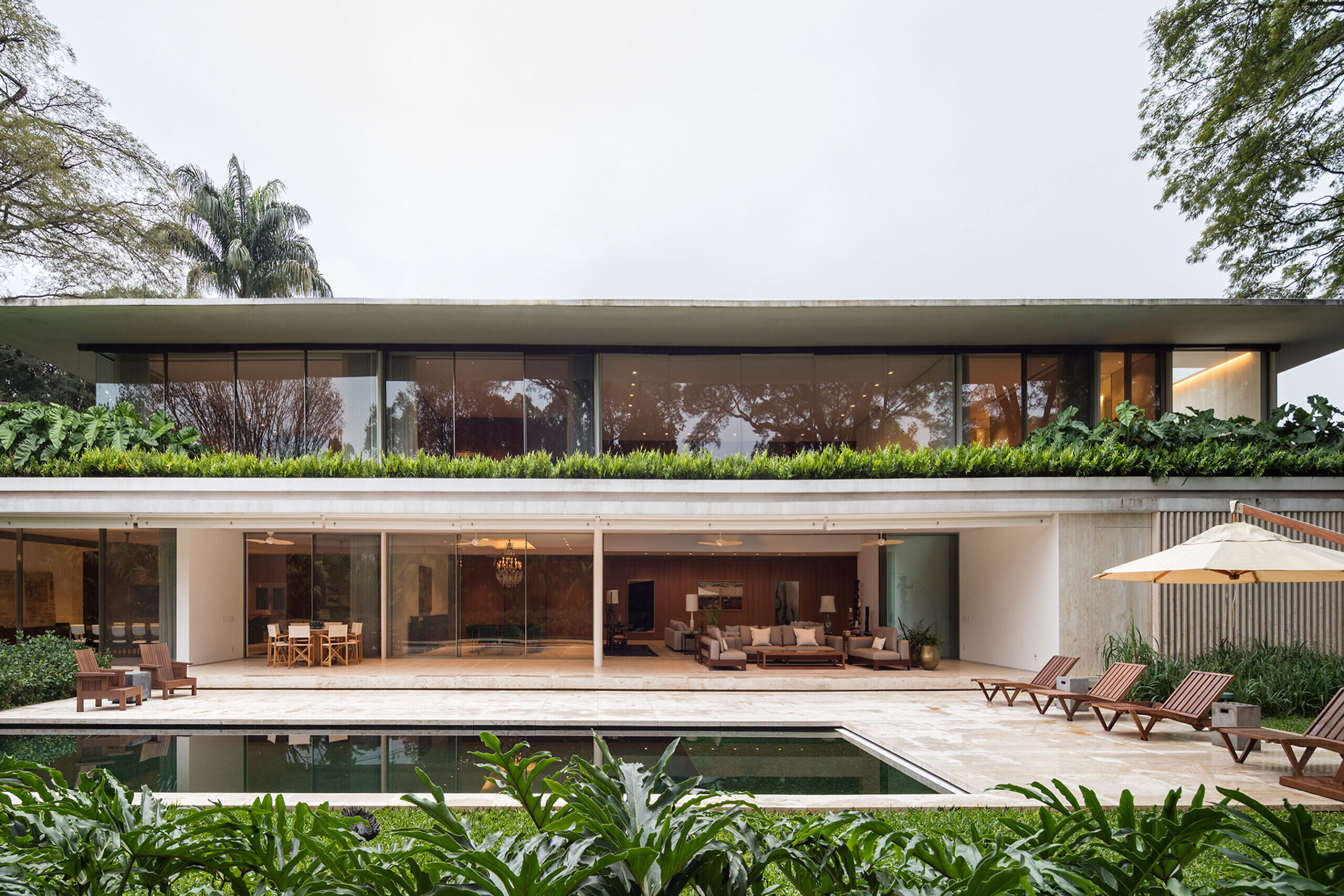
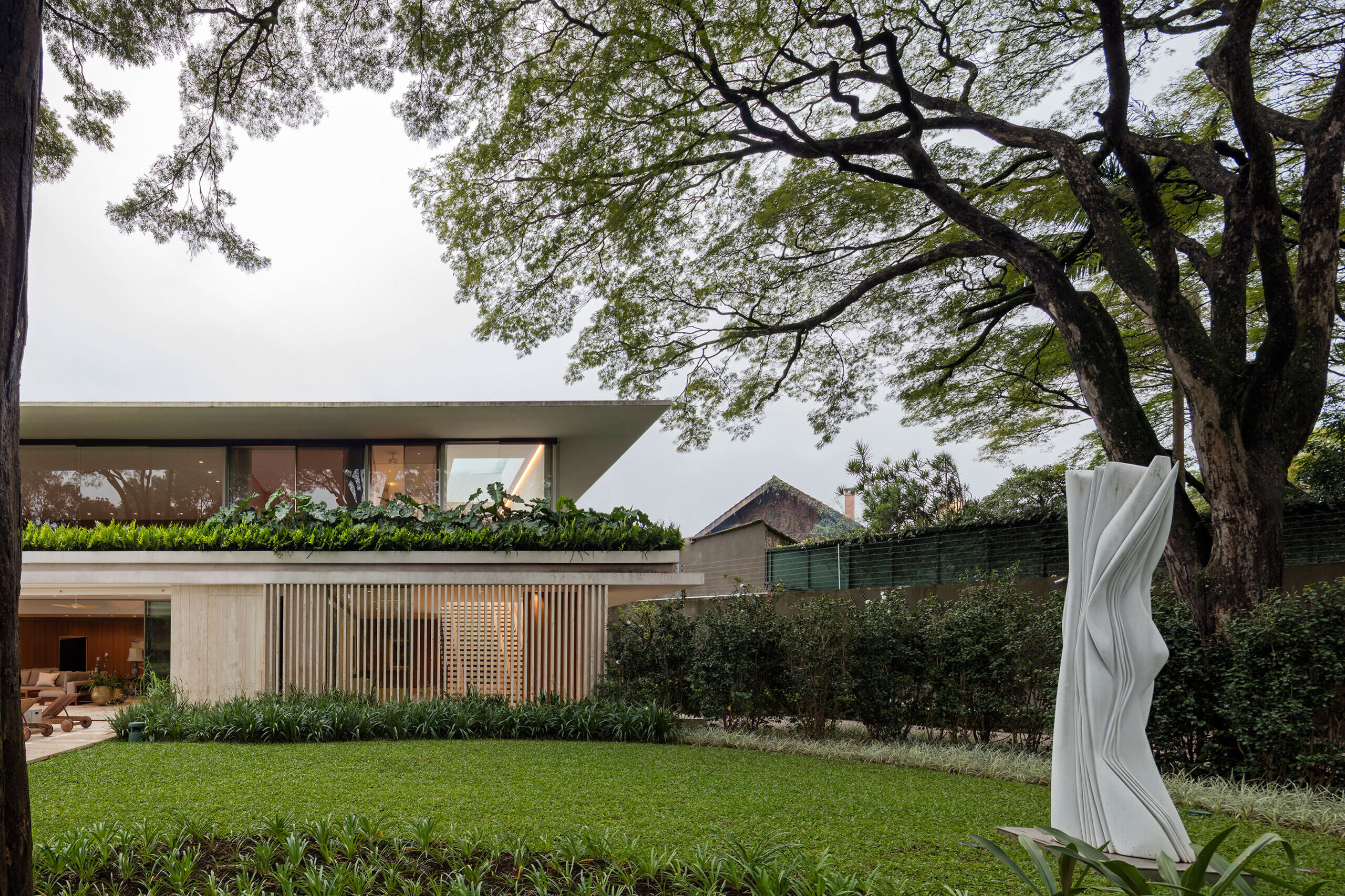
The idea that oriented the project from the implementation of the design through to structural and systems concept of openings and the choice of finishes was the due to the dominating figures of four 30-meter-high Sibipiruna trees and more than 20 meters of treetops located on the front of the grounds.
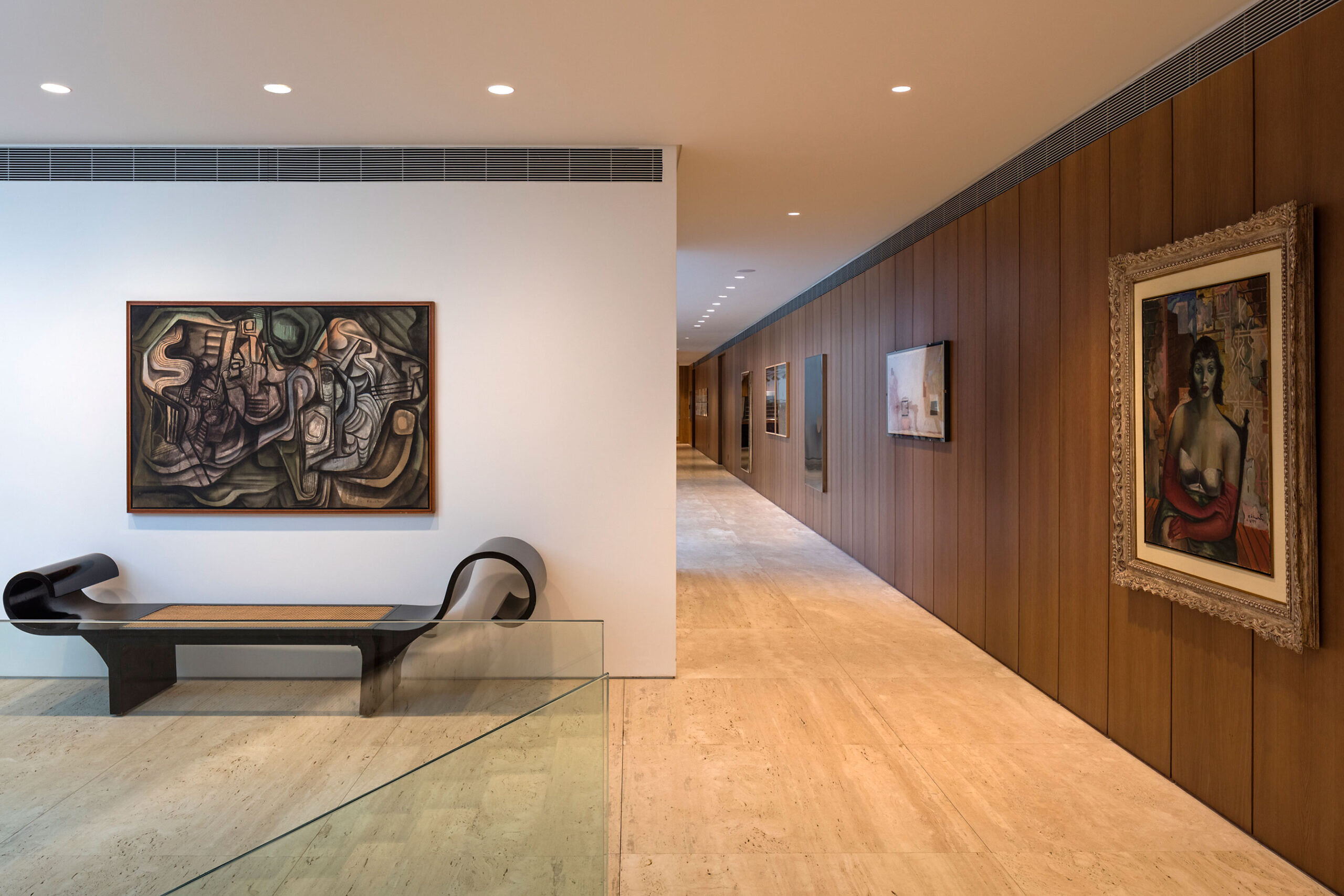
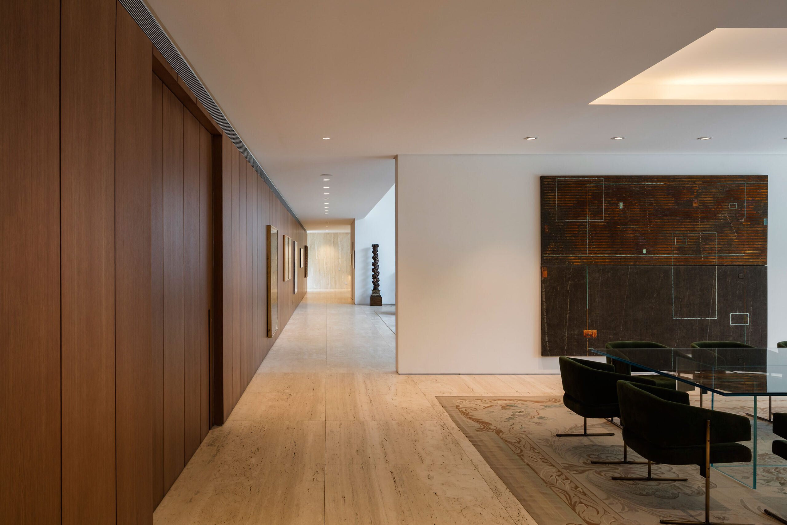
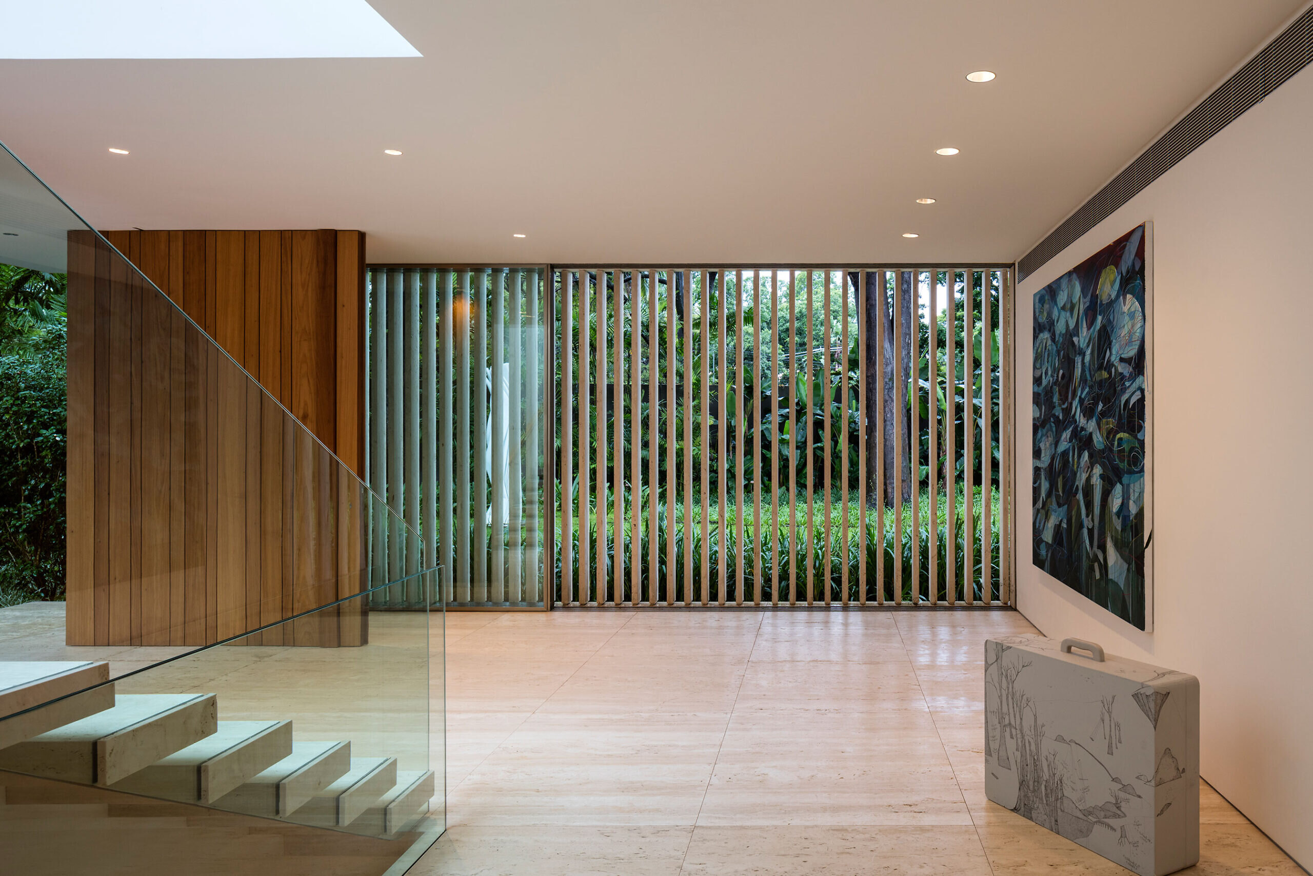
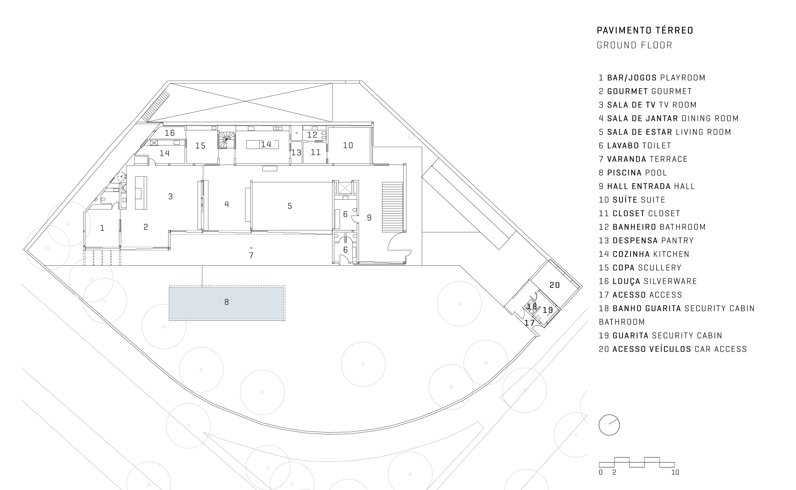
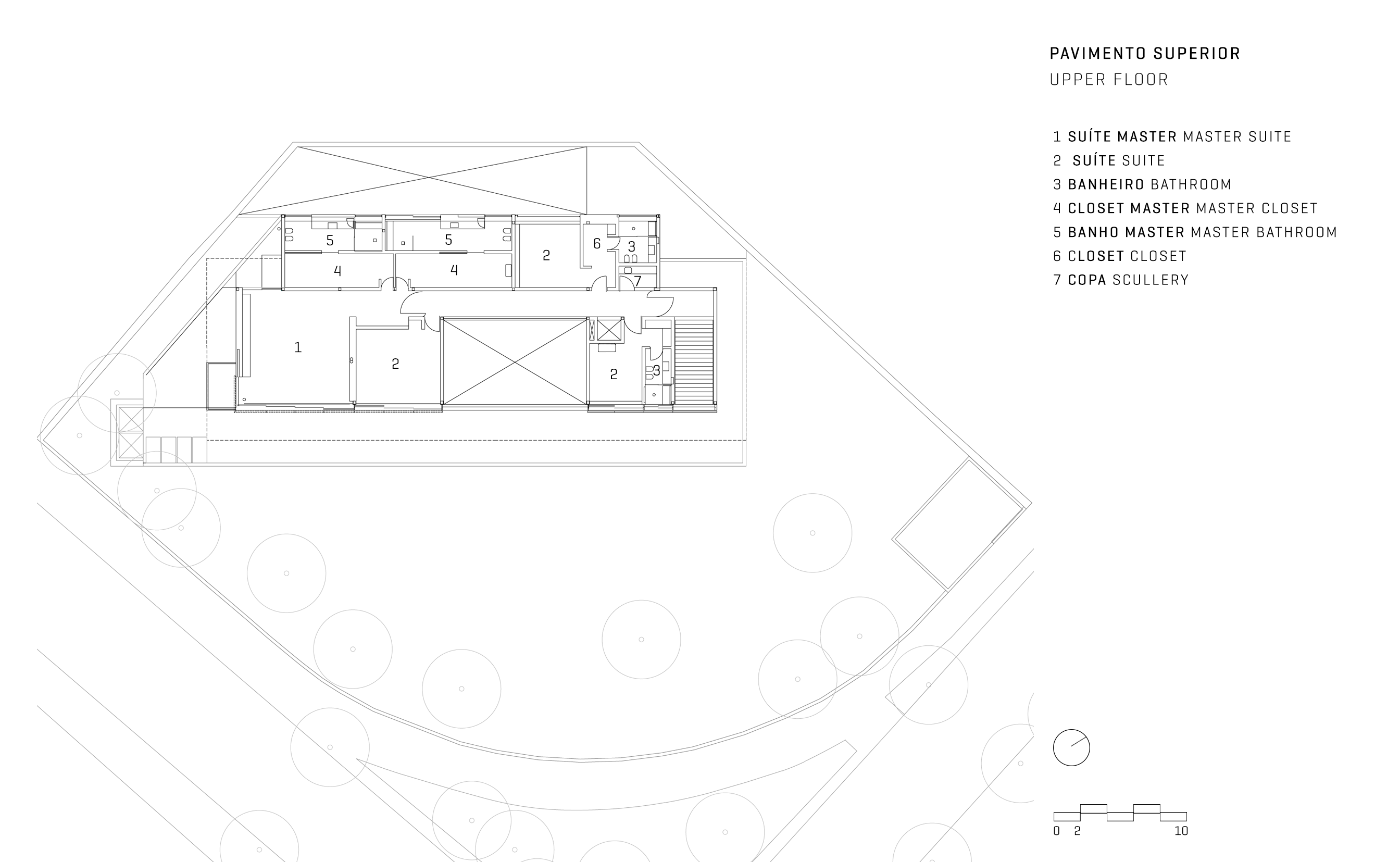
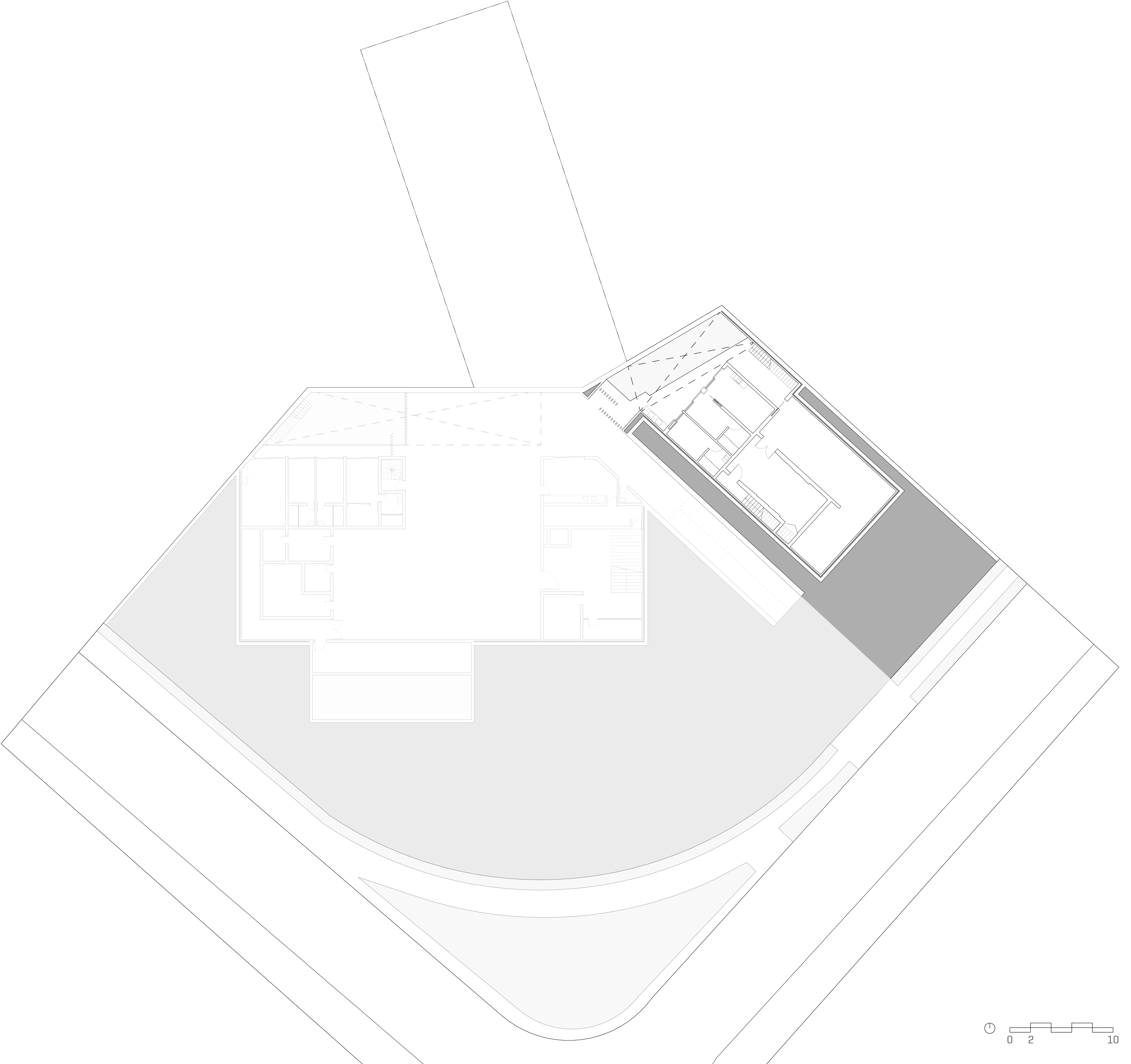
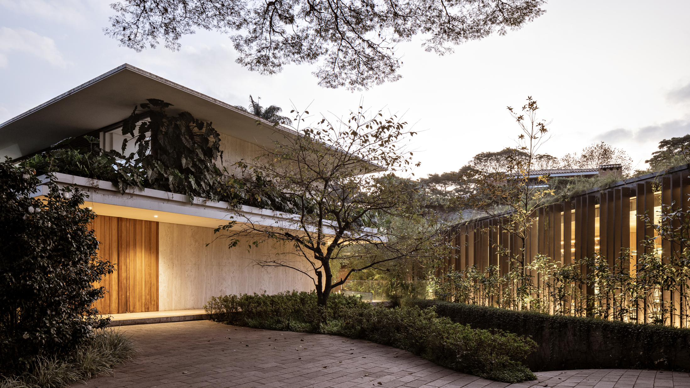
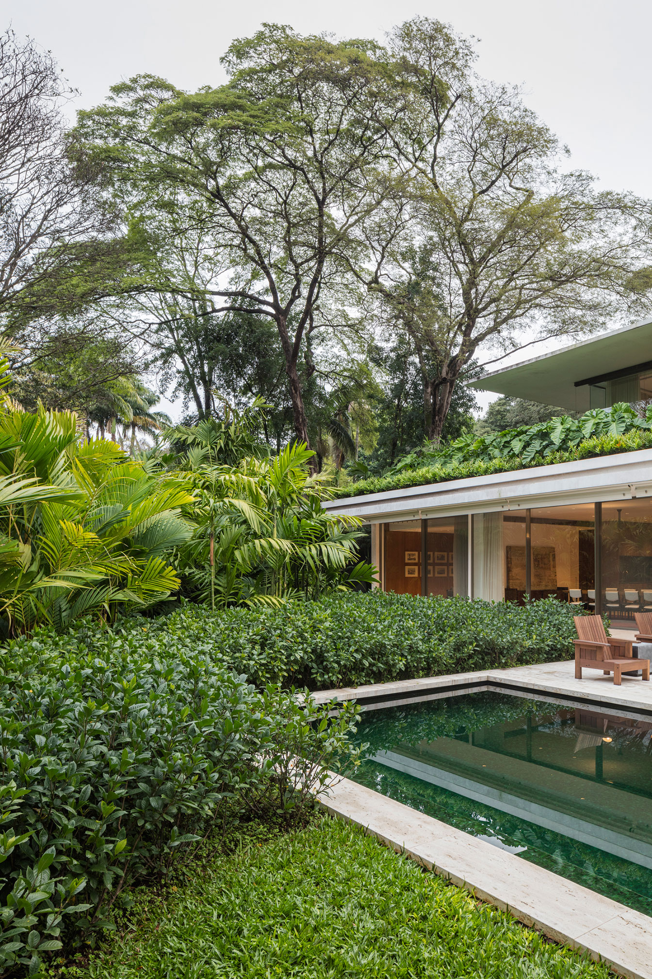
The house was positioned to be as far from the trees as possible, so that we could have an ample view of the treetops from virtually all inside environments of the residence’s two main levels. Therefore, we also created a dense garden for the social area and wide access to the entrance of the house and the garage under it.
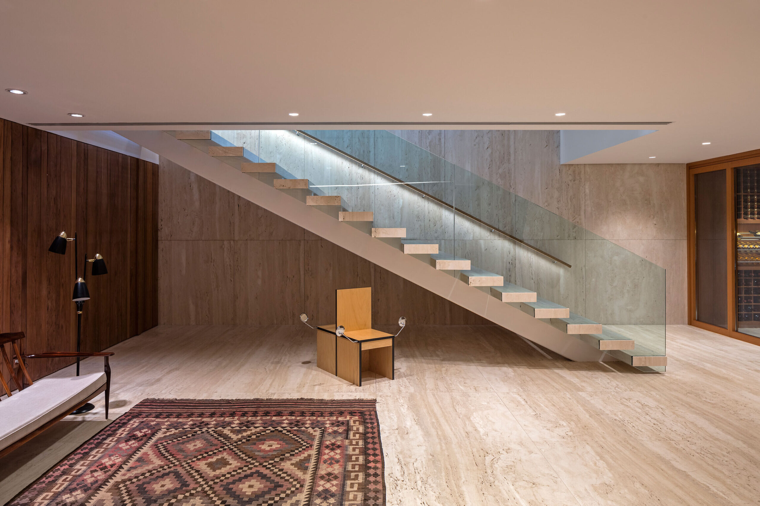
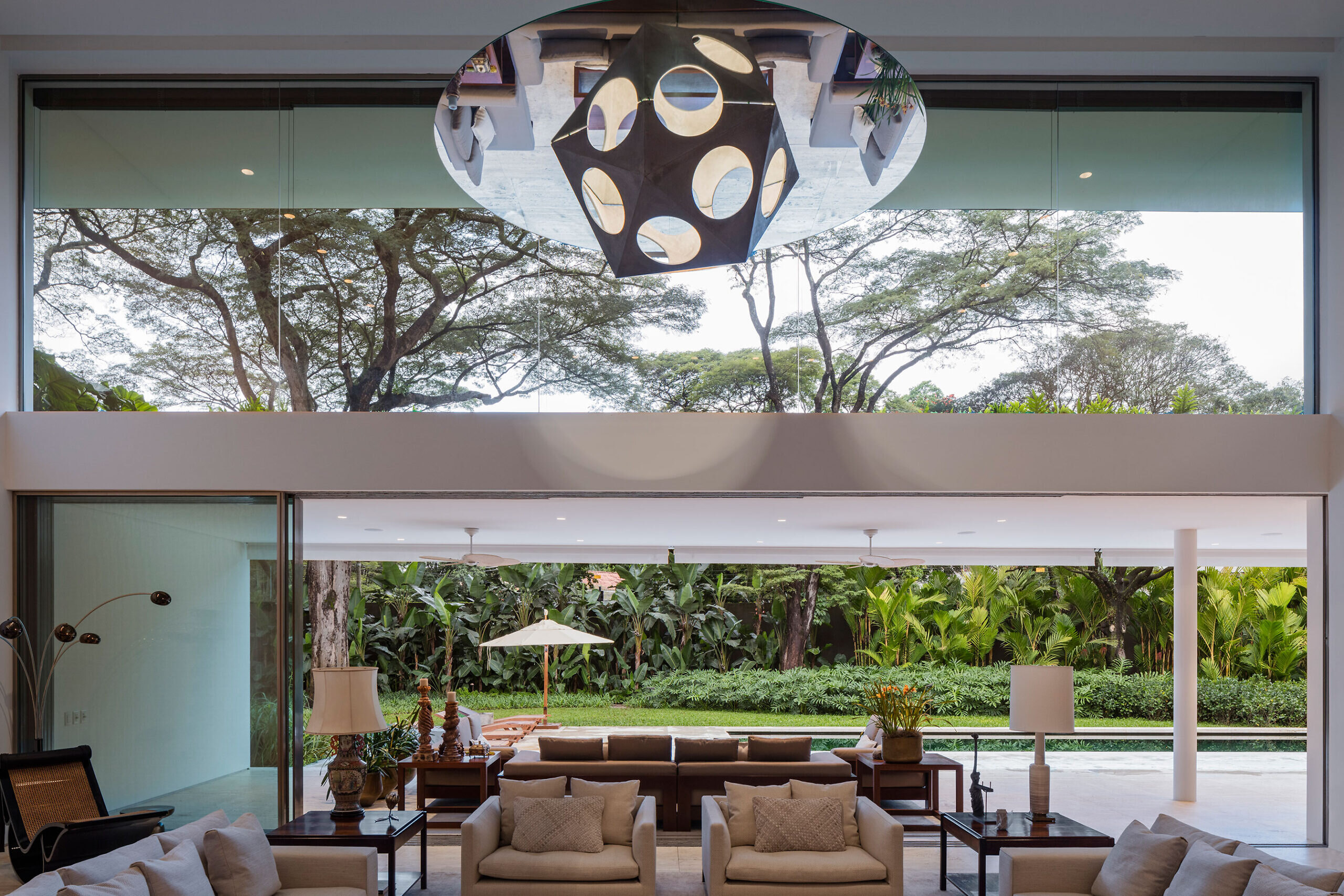
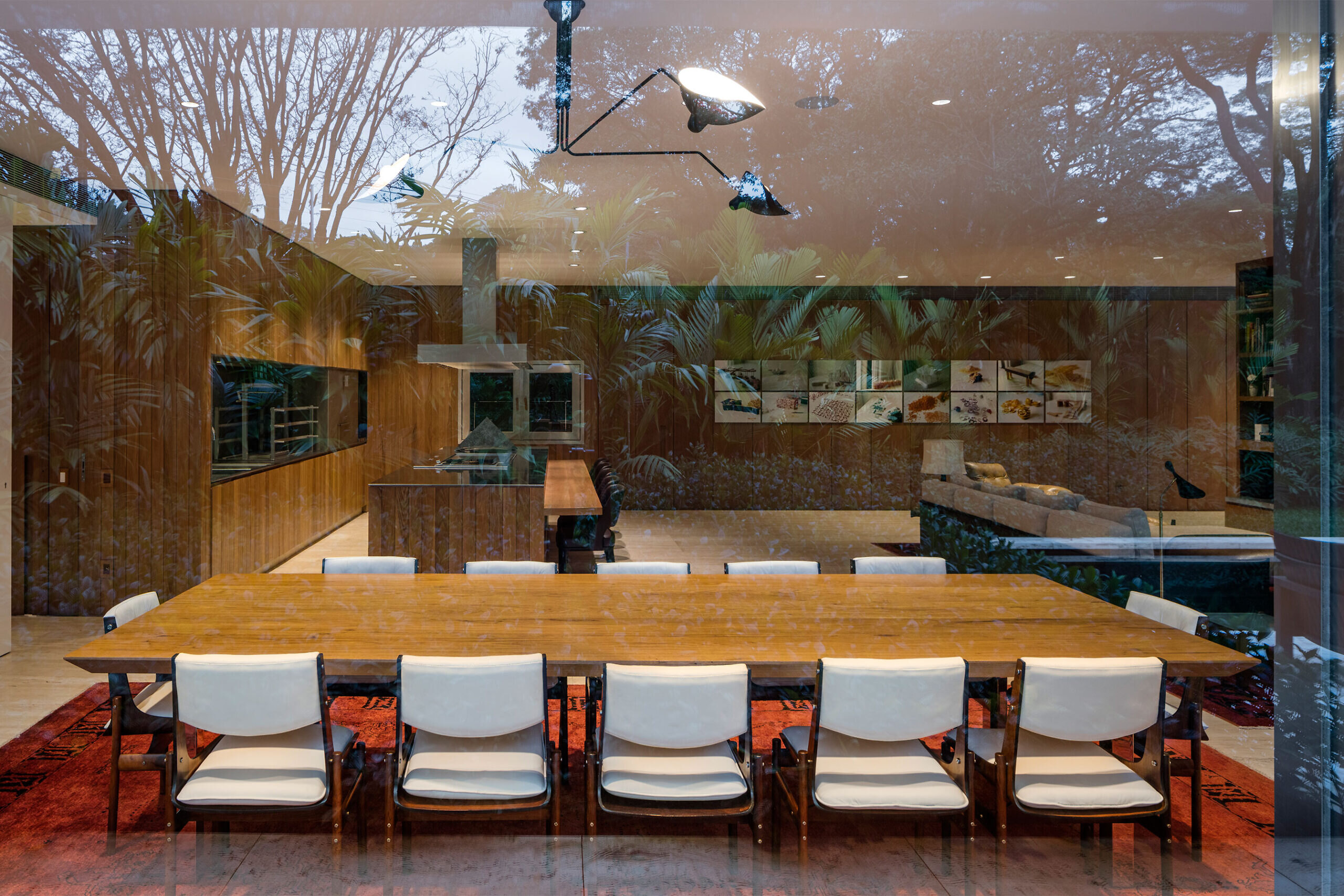
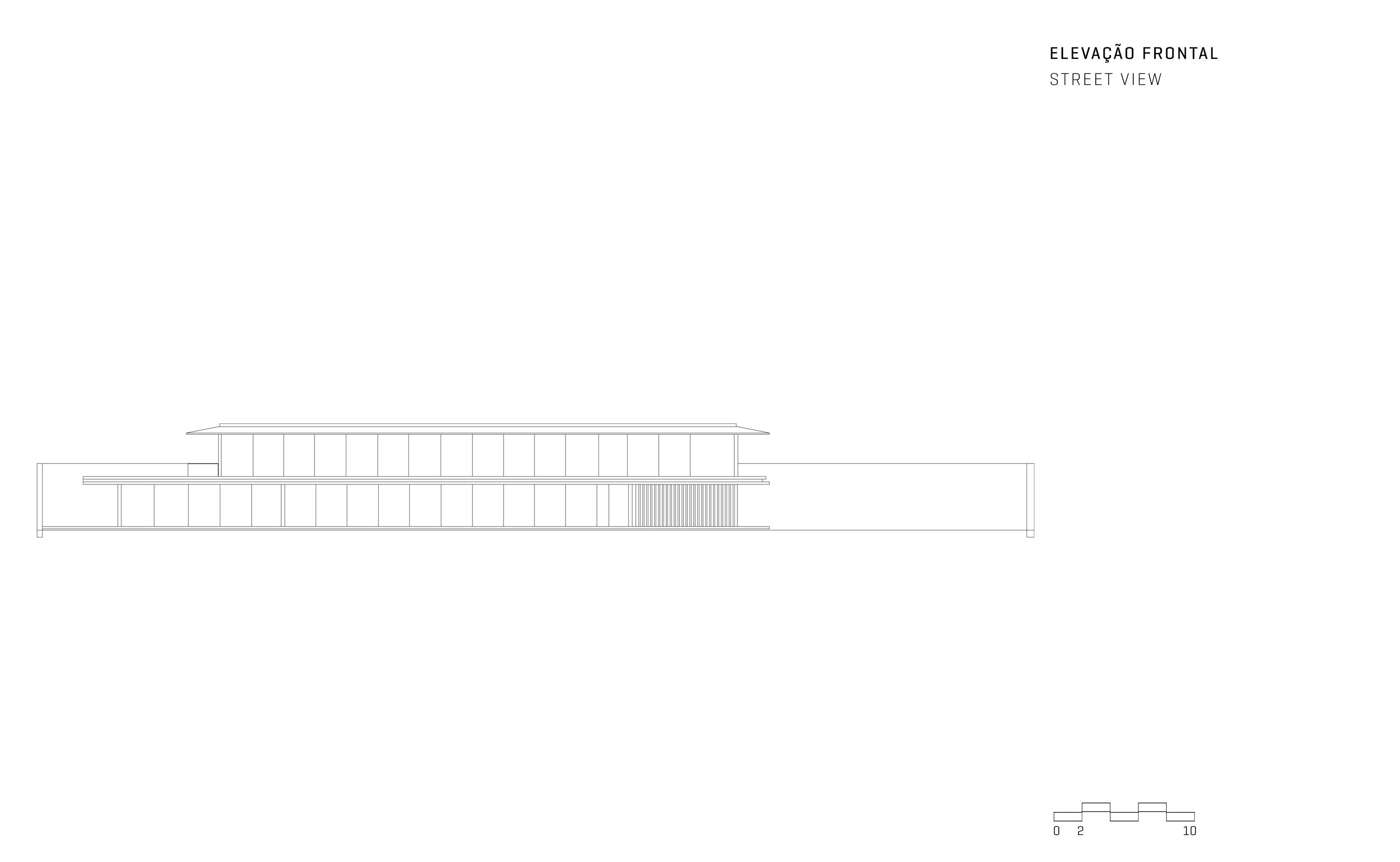
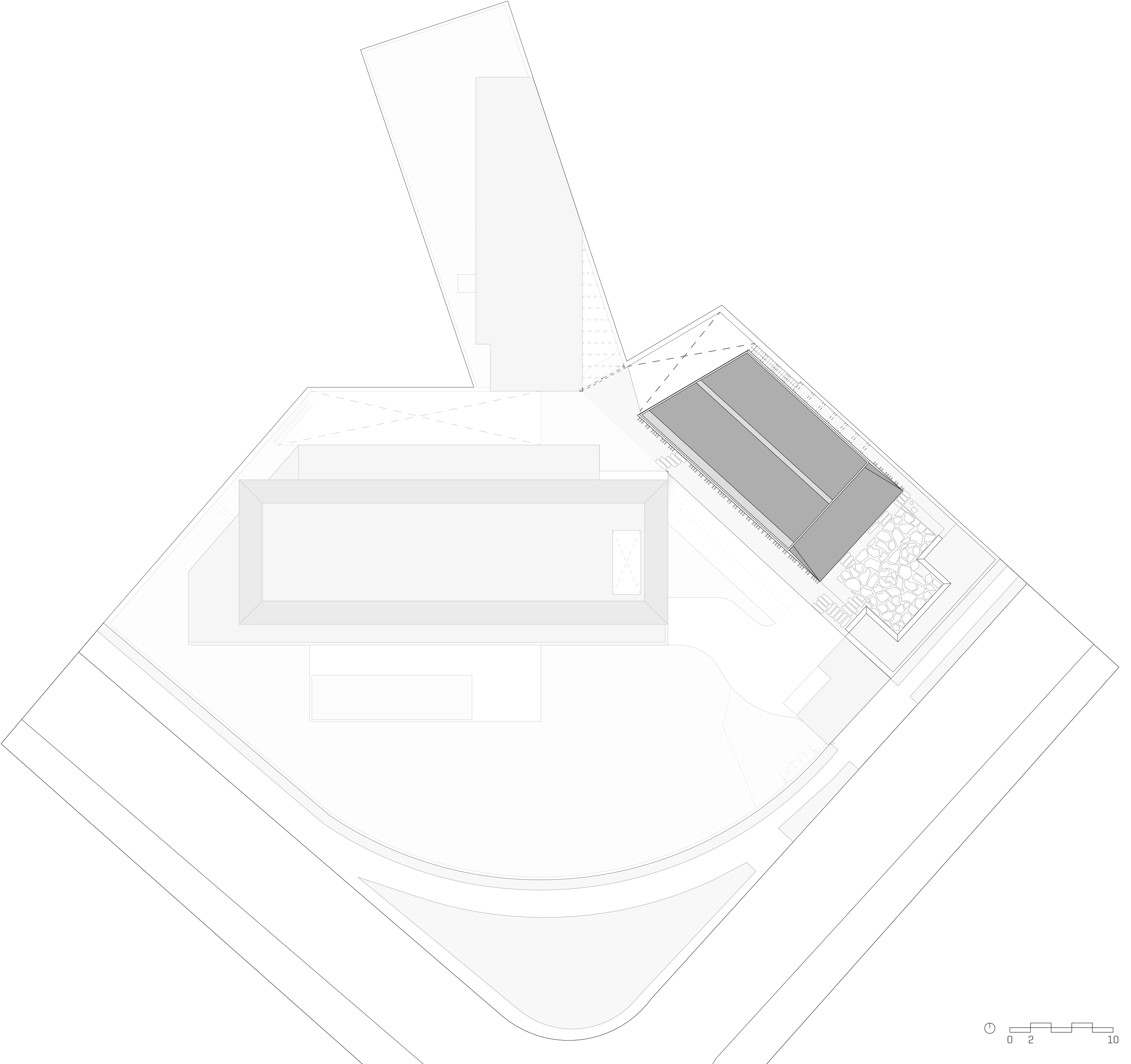
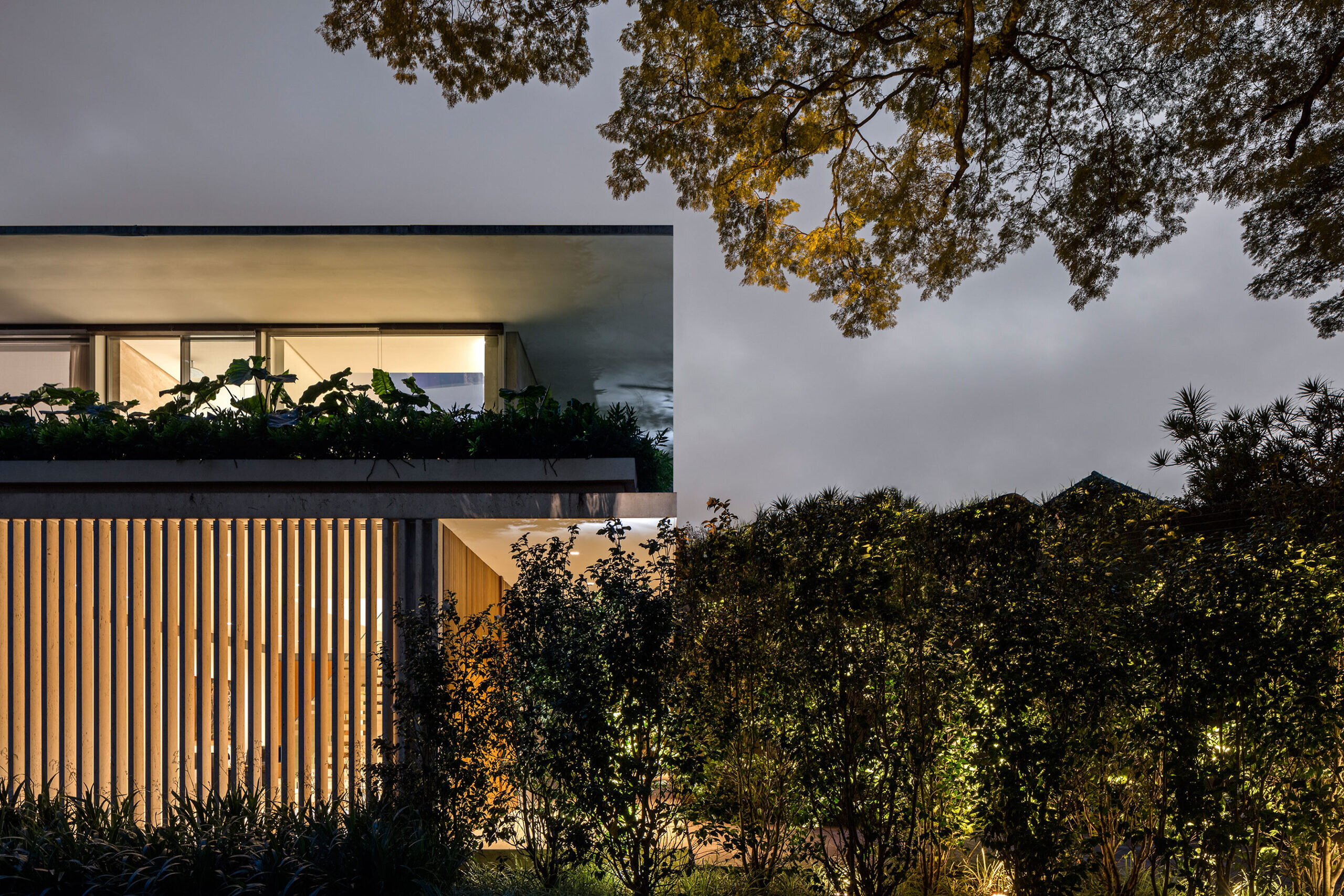
Materially, we used horizontality and transparency to neutralize the architecture regarding the nature surrounding the house. The structural project proposes tight horizontal planes in balance and the closures, in their majority, consist of large glass panels.
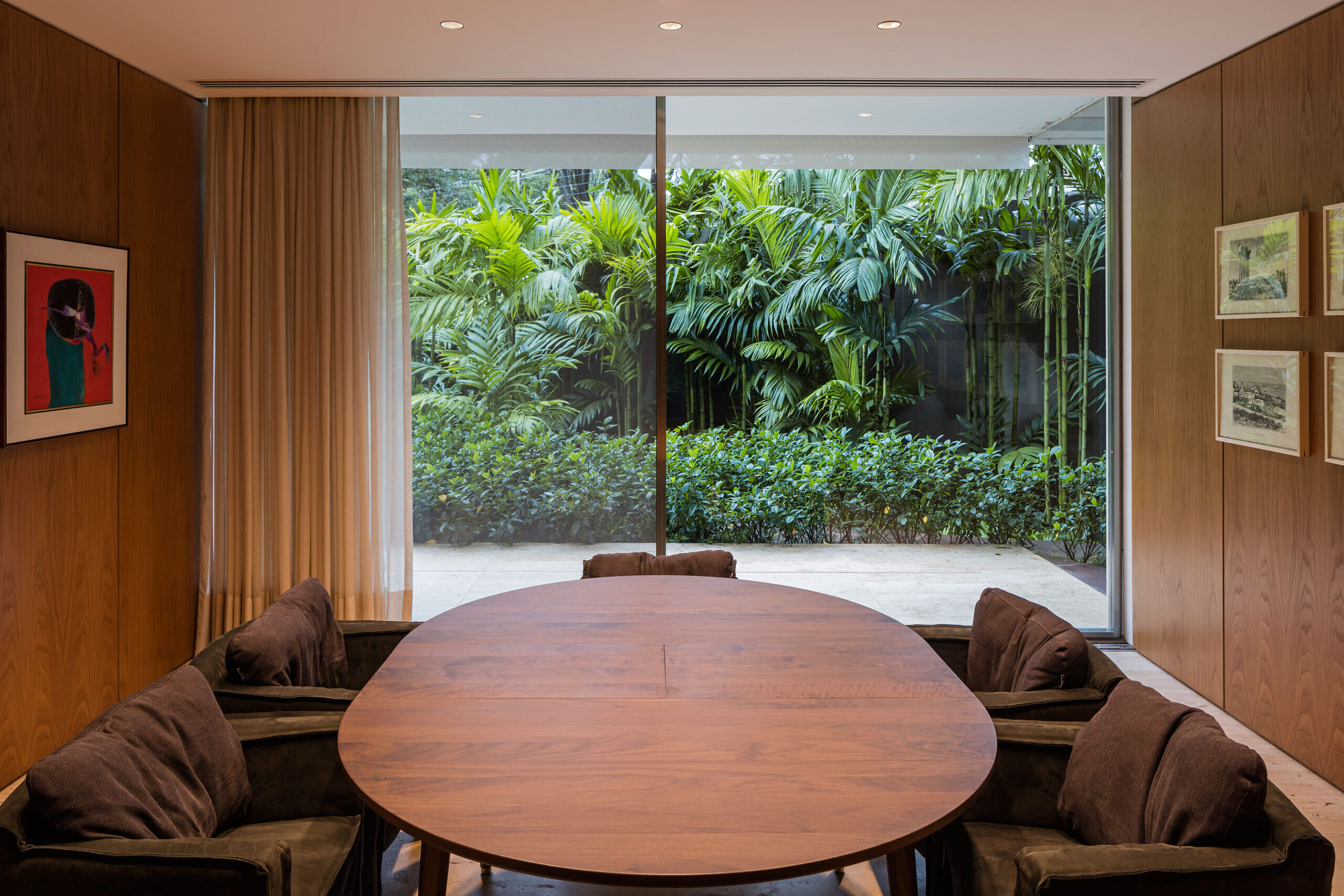
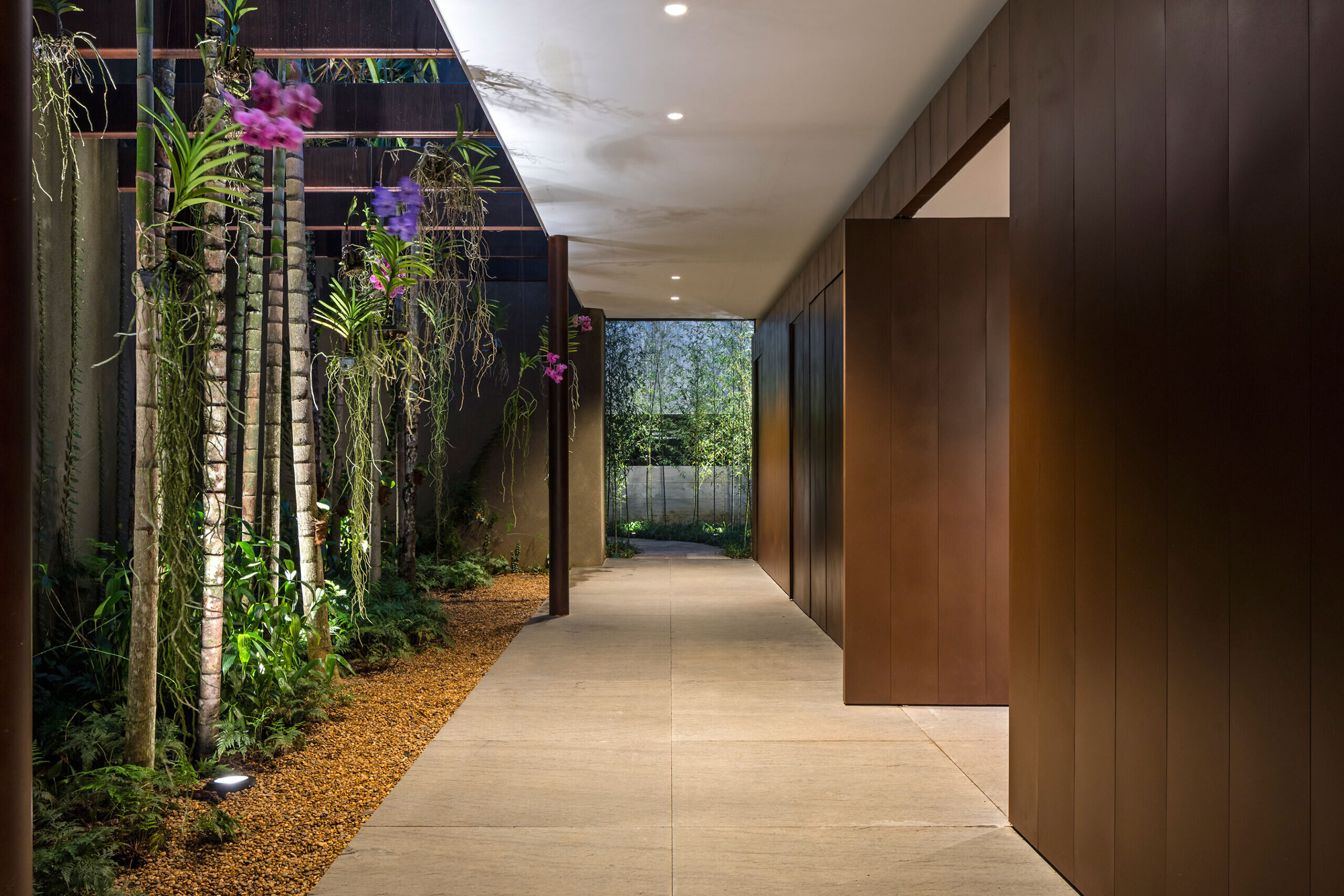
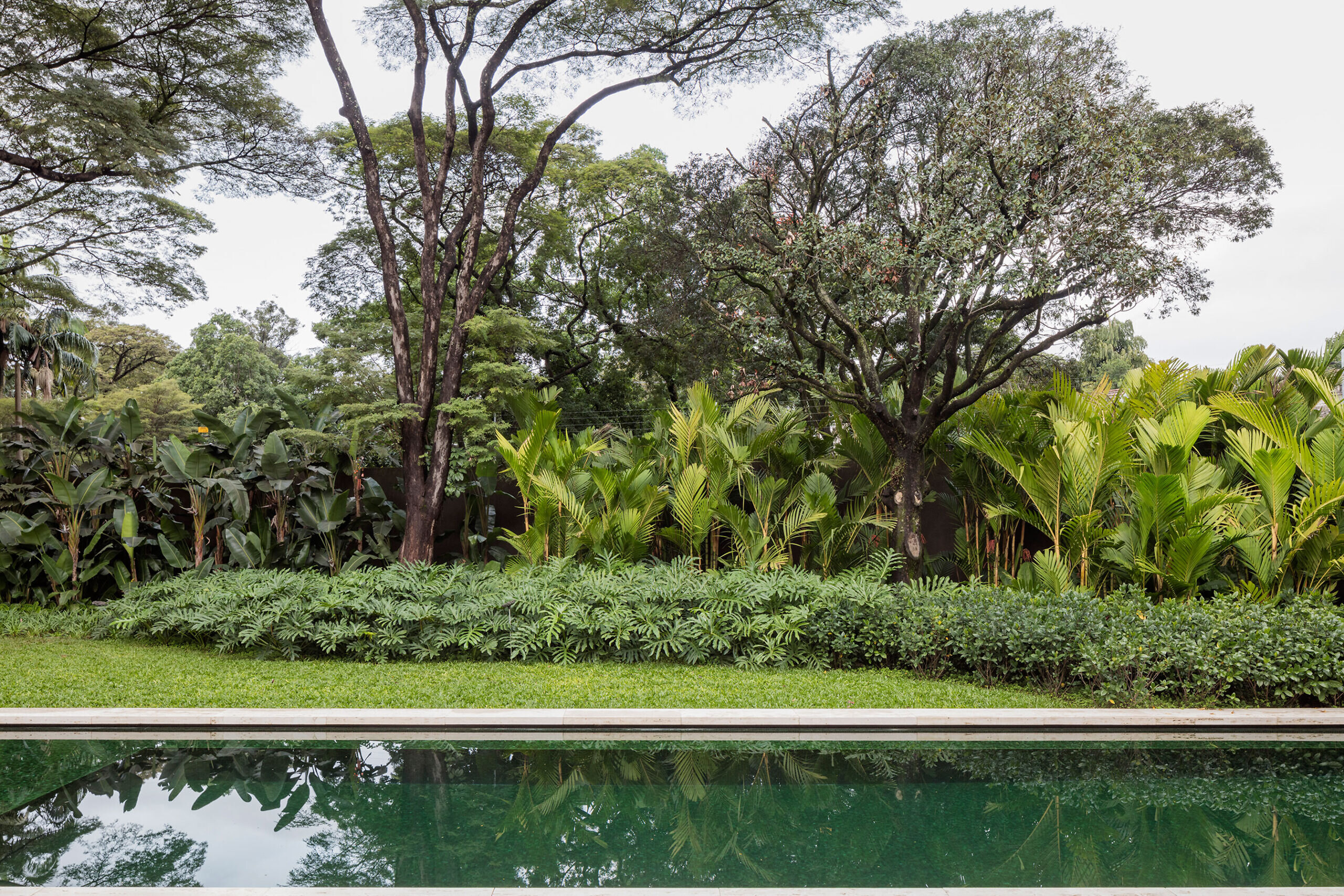
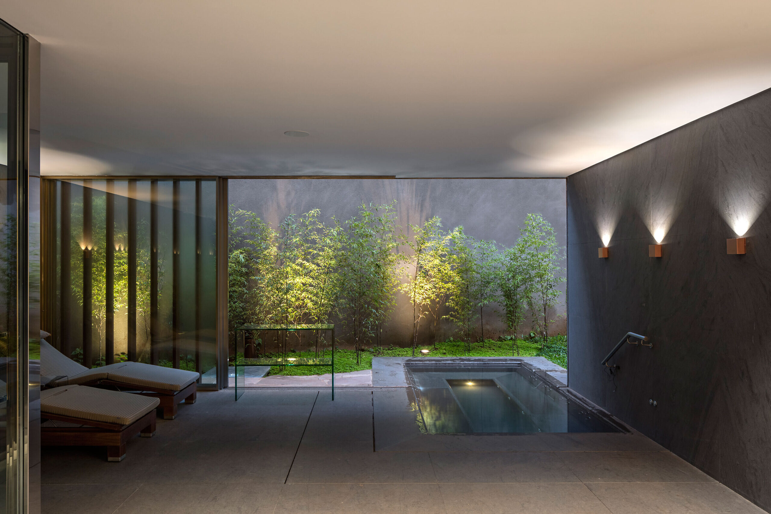
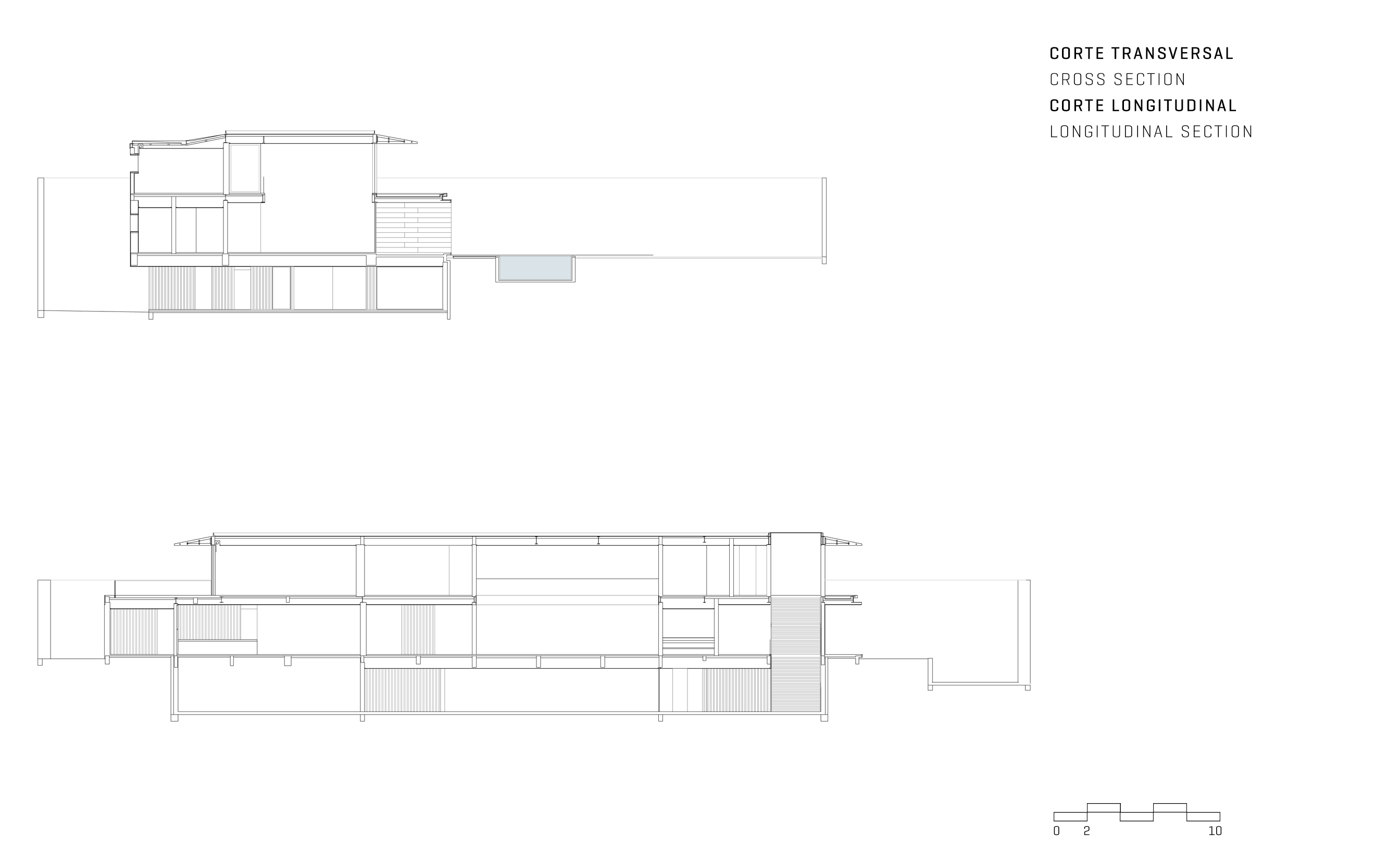
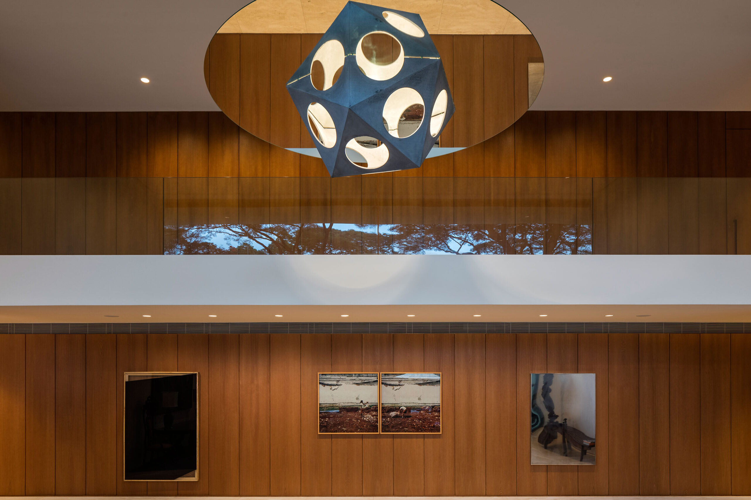
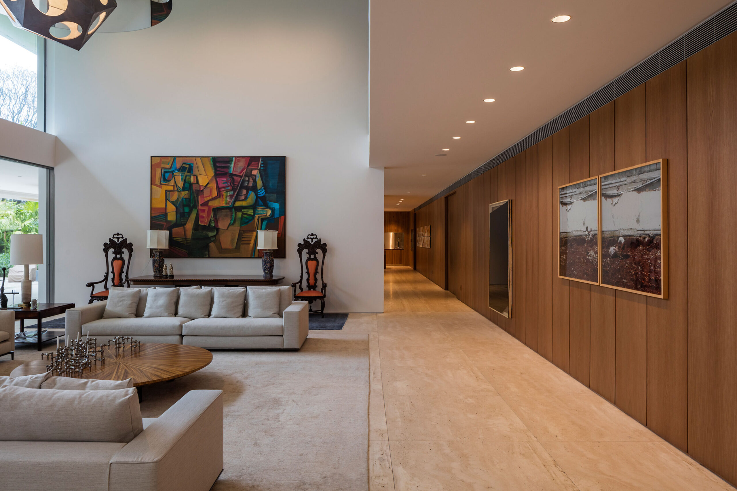
Spatially, we proposed constant interaction between interior and exterior while also bringing light and natural elements to the architecture. This intention was translated into project choices such as a large skylight in the entrance hall, a doubly-high living room ceiling, external blinds on the facade of the upper floor and a garden on the roof of the balcony.
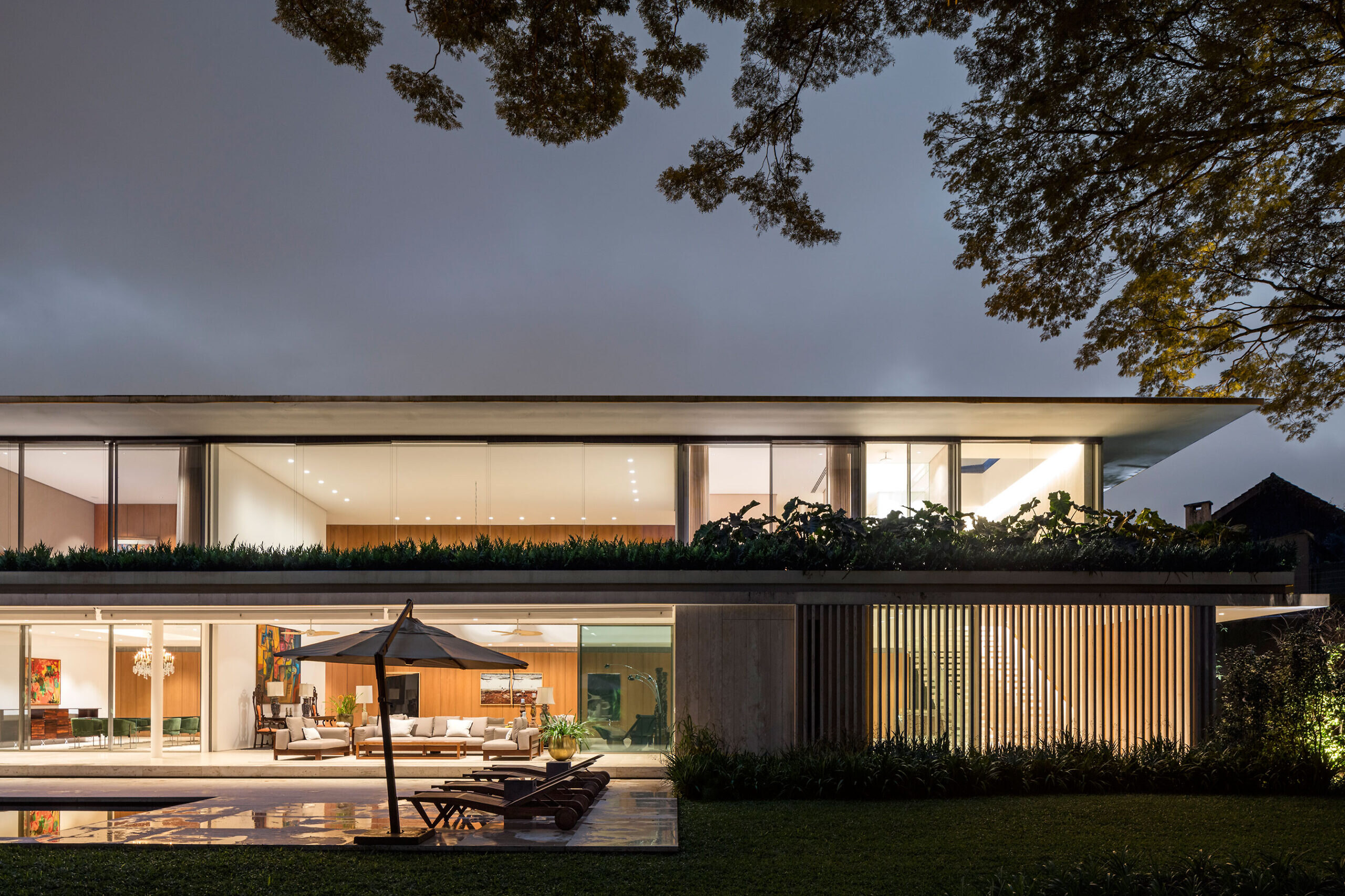
THE EXTENSION
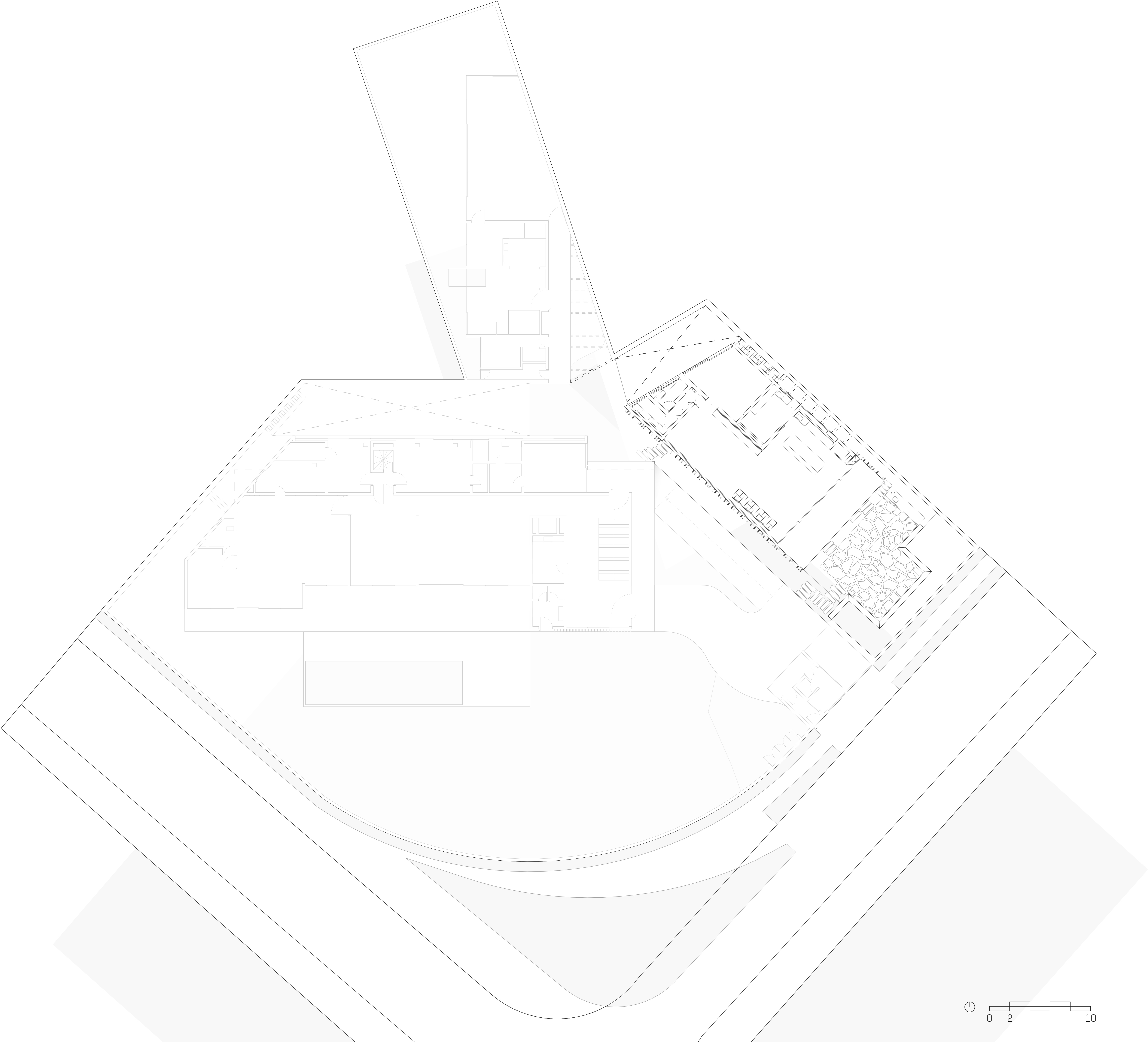
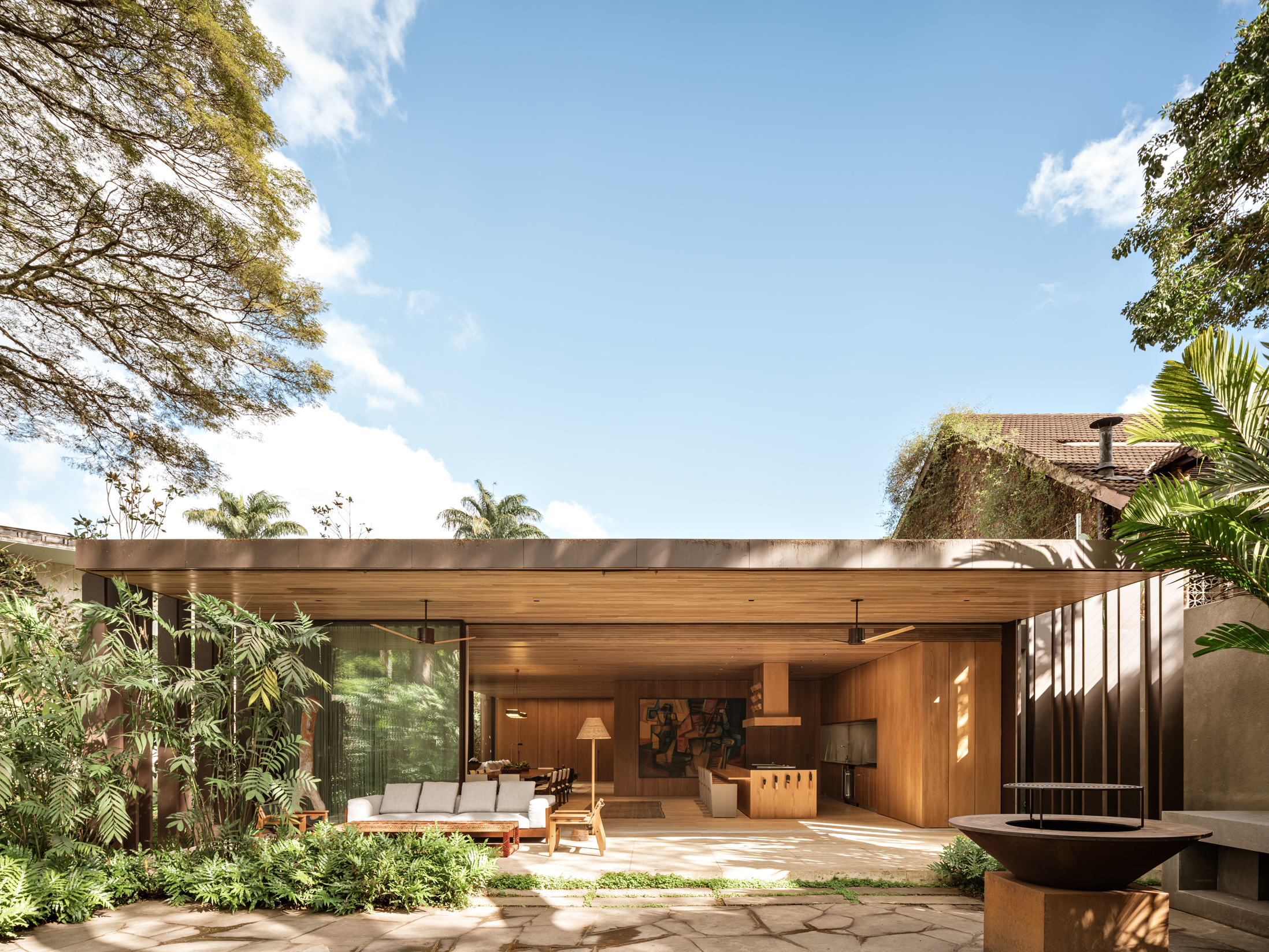
The extension was conceived as an independent space from the main building, also designed by the office. Primarily social, its function is to welcome friends and family.
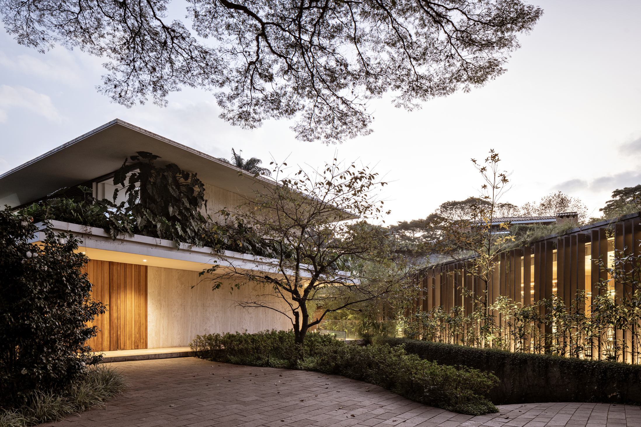
Some features of the original house were also used in the extension. Among them, the brise-soleils and the travertine floor. The eaves, so characteristic of our projects, were left aside here in a deliberate gesture: so that the architecture of the new building would not visually prevail over the original construction. The trees, original to the land, were incorporated into the design of the external area.
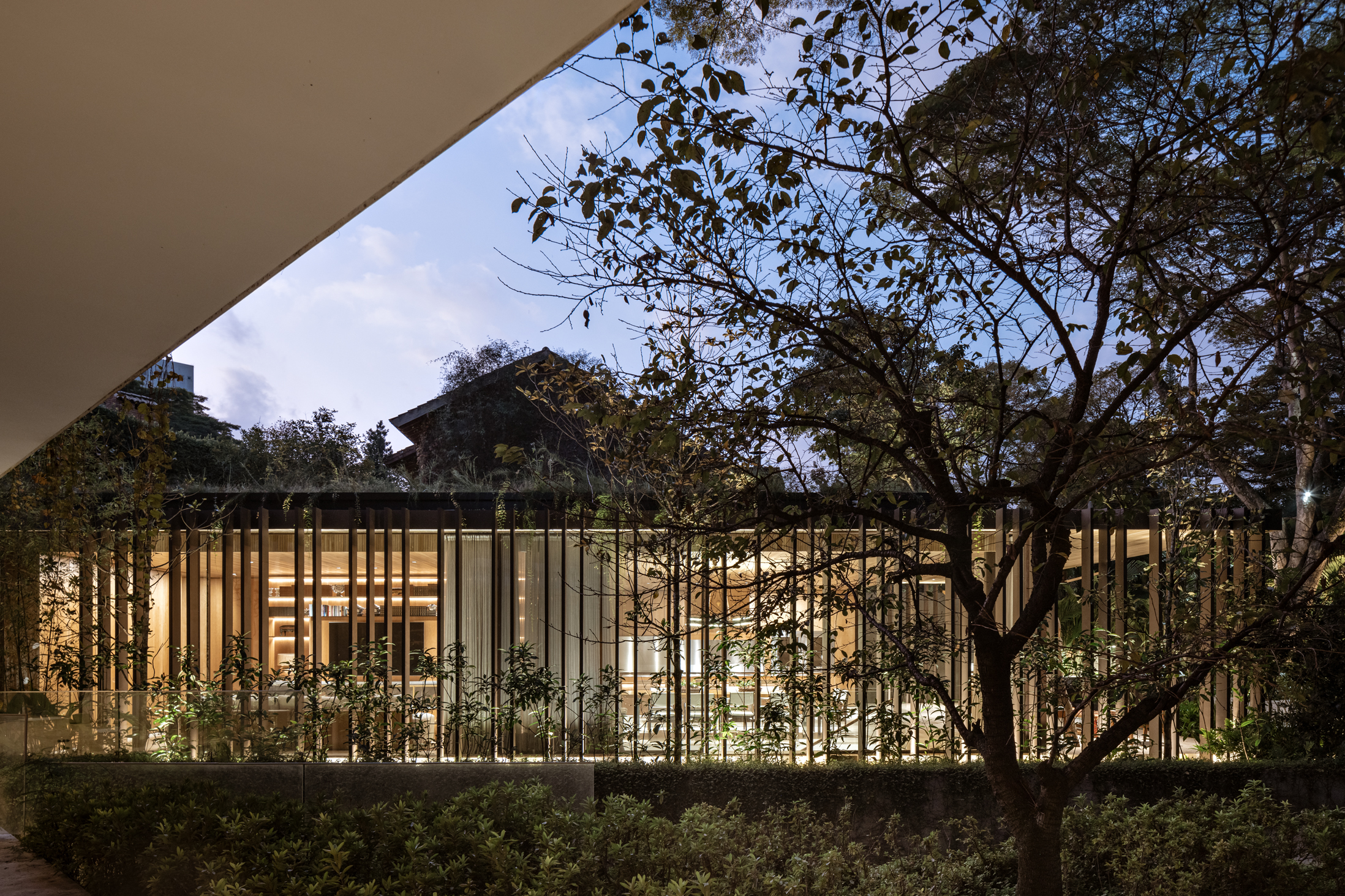
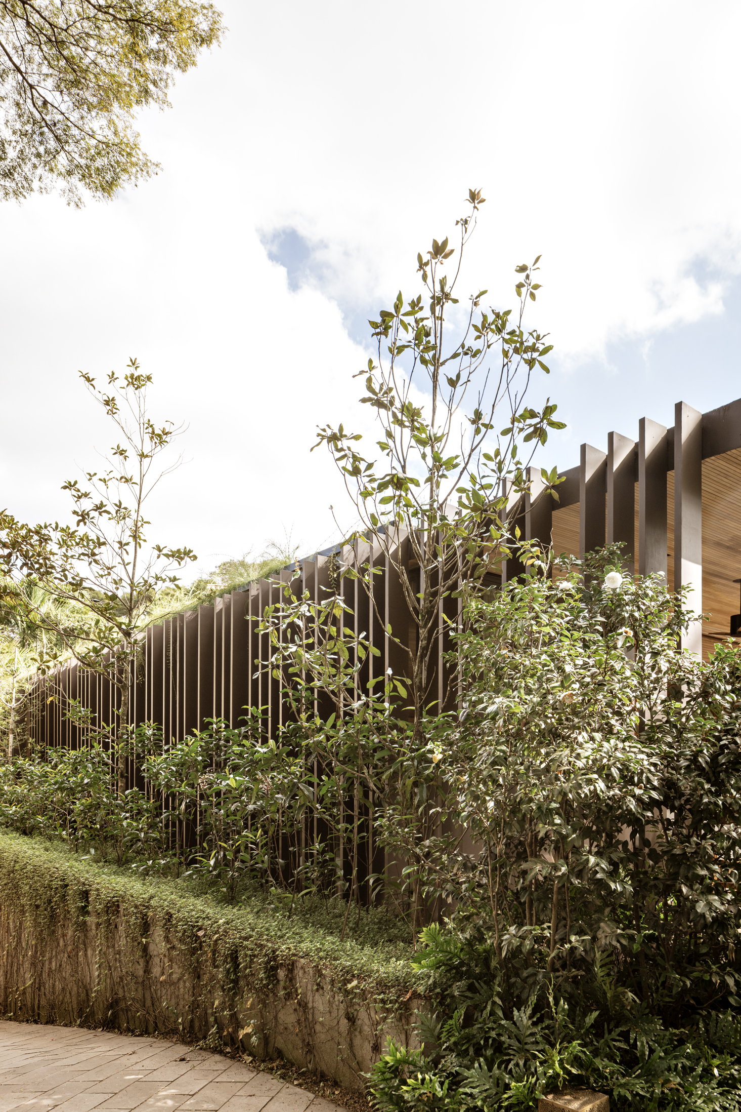
The corten steel brise-soleils, unevenly distributed, and the transparency of the large glass panels help the façade to become almost invisible. The option for a metal structure allowed the extension to be built quickly.
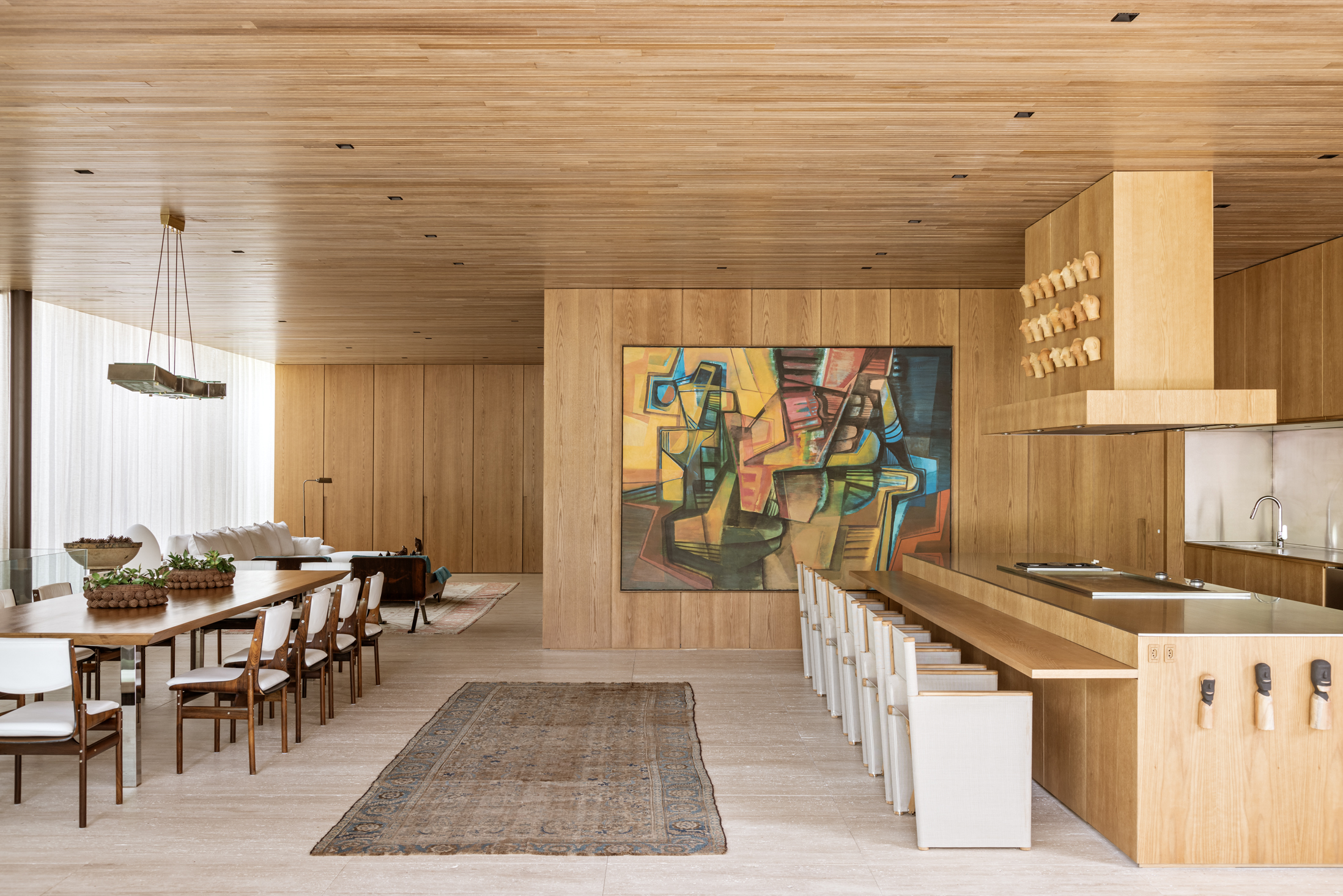
The outdoors and indoors blend together, with the barbecue area continuing directly into the kitchen, which was designed for large banquets.
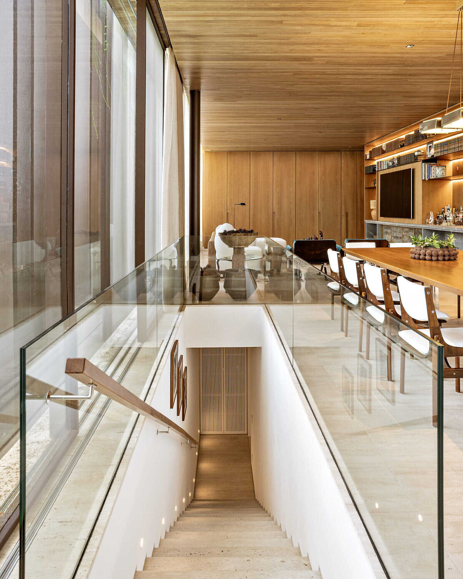
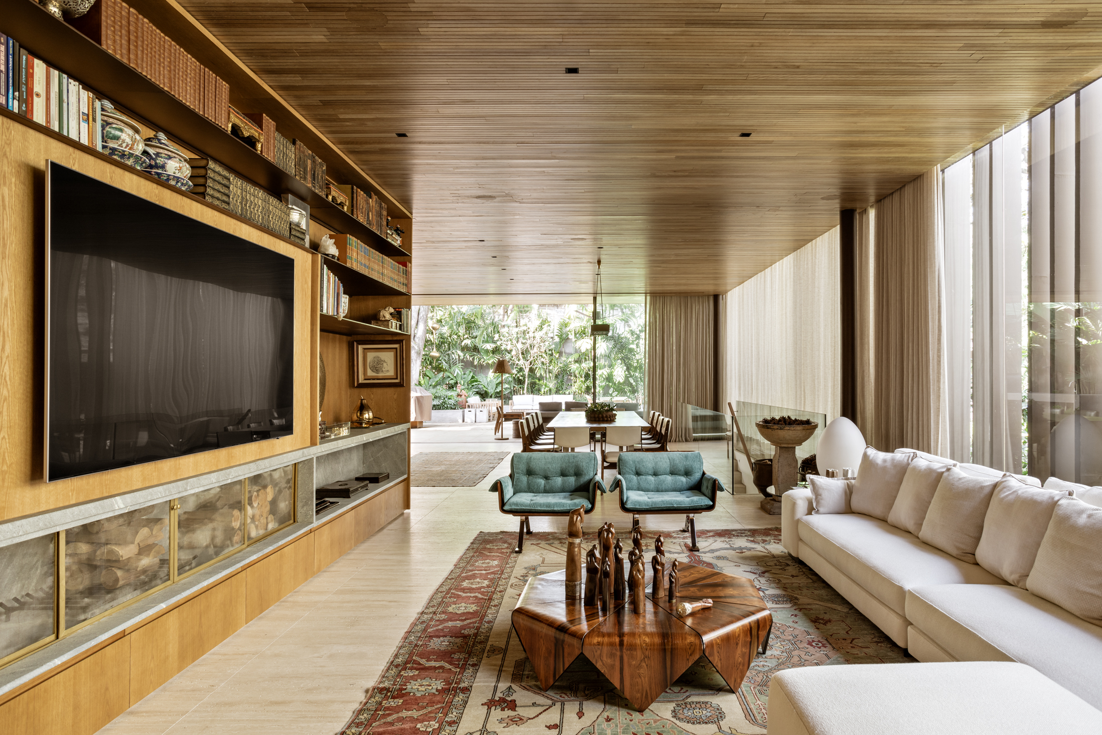
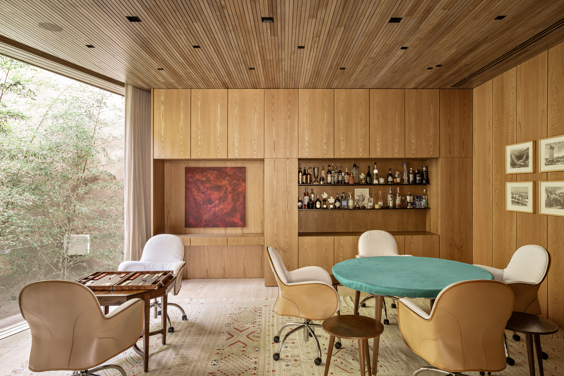
Continuing into the space, a long dining table marks the transition to the home theater. The decor is a mix of the client’s old furniture with more current furniture chosen by the office. In the background, a wooden panel opens into a game room.
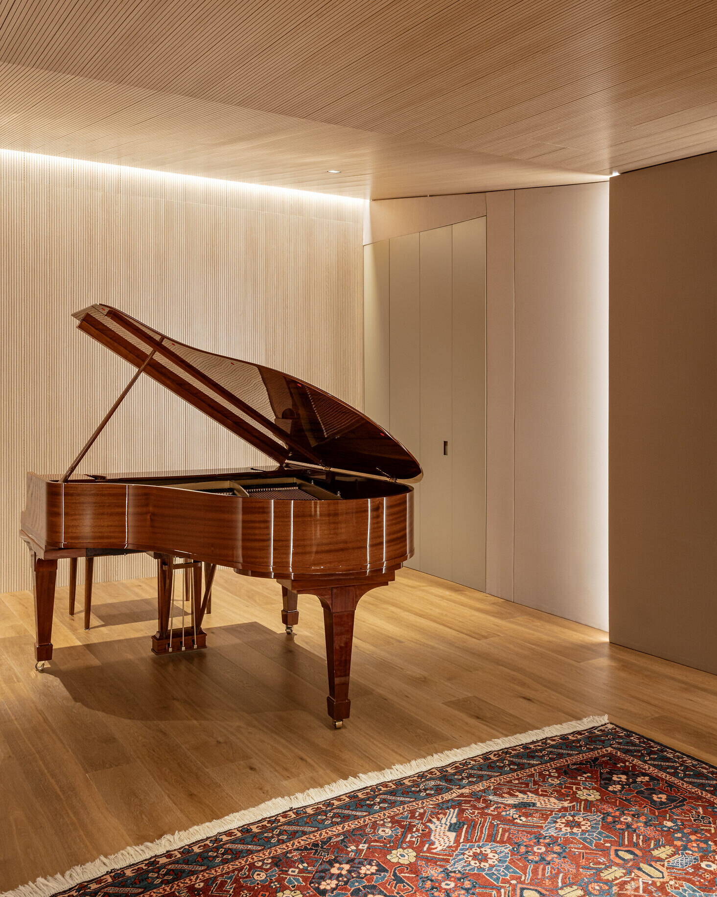
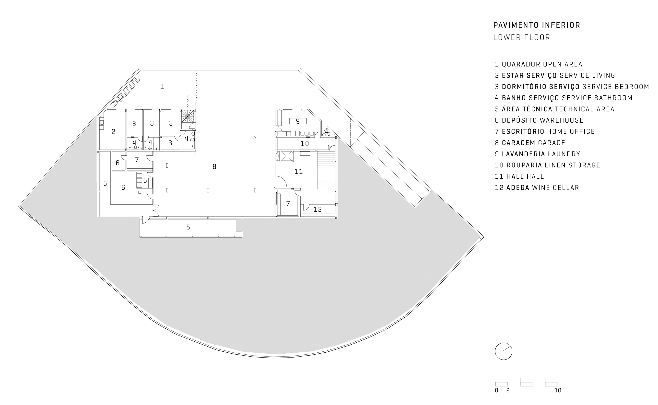
Next to the dining table, a staircase leads to the basement, where a grand piano is the centerpiece of a studio. The entire service area is also located on this floor, which connects to the service area of the main house through a direct passage.
