Guilhermina Building
Leblon, RJ

Facts
- Total Area
- 1.194,58 m²
- Built Area
- 5.140,13 m²
- Start
- 2016
Project
- Office
- Jacobsen Arquitetura
- Office's Team
- Paulo Jacobsen, Bernardo Jacobsen, Edgar Murata, Marcelo Vessoni, Christian Rojas, Fernanda Maeda, Guilherme Pucci, Eduardo Aparício, Gustavo Borges, Thauan Miquelin
- Interiors
- Jacobsen Arquitetura
- Interior's Team
- Tatiana Kamogawa, Mariana Ferretti
We have been given the responsibility of transforming the former Saint Patricks school, one of the strongest architectural memories of the 20th century in the Leblon neighborhood, into a commercial project.
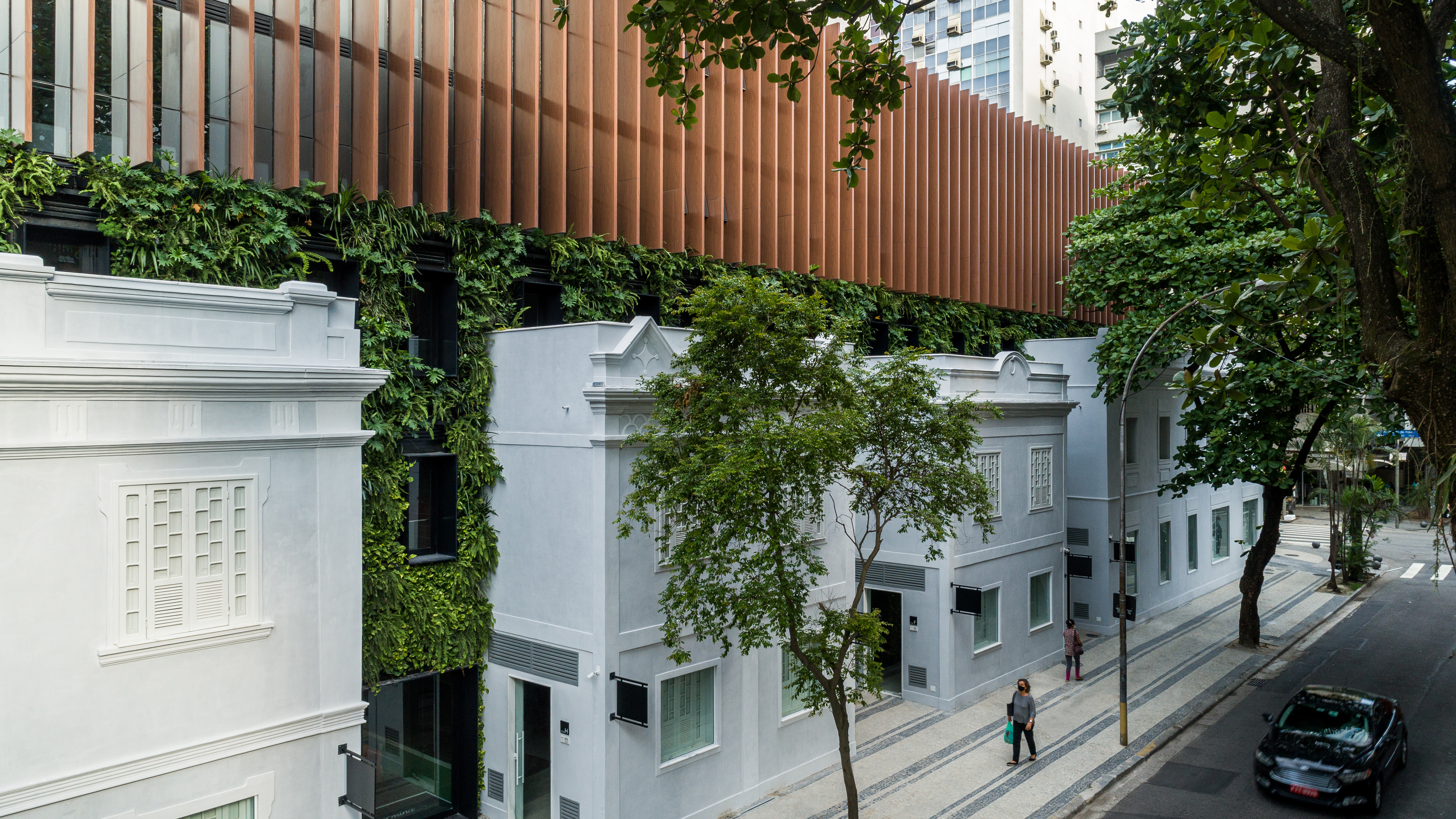
The façade, a preserved cultural landmark, was the central element from which the entire project took shape.
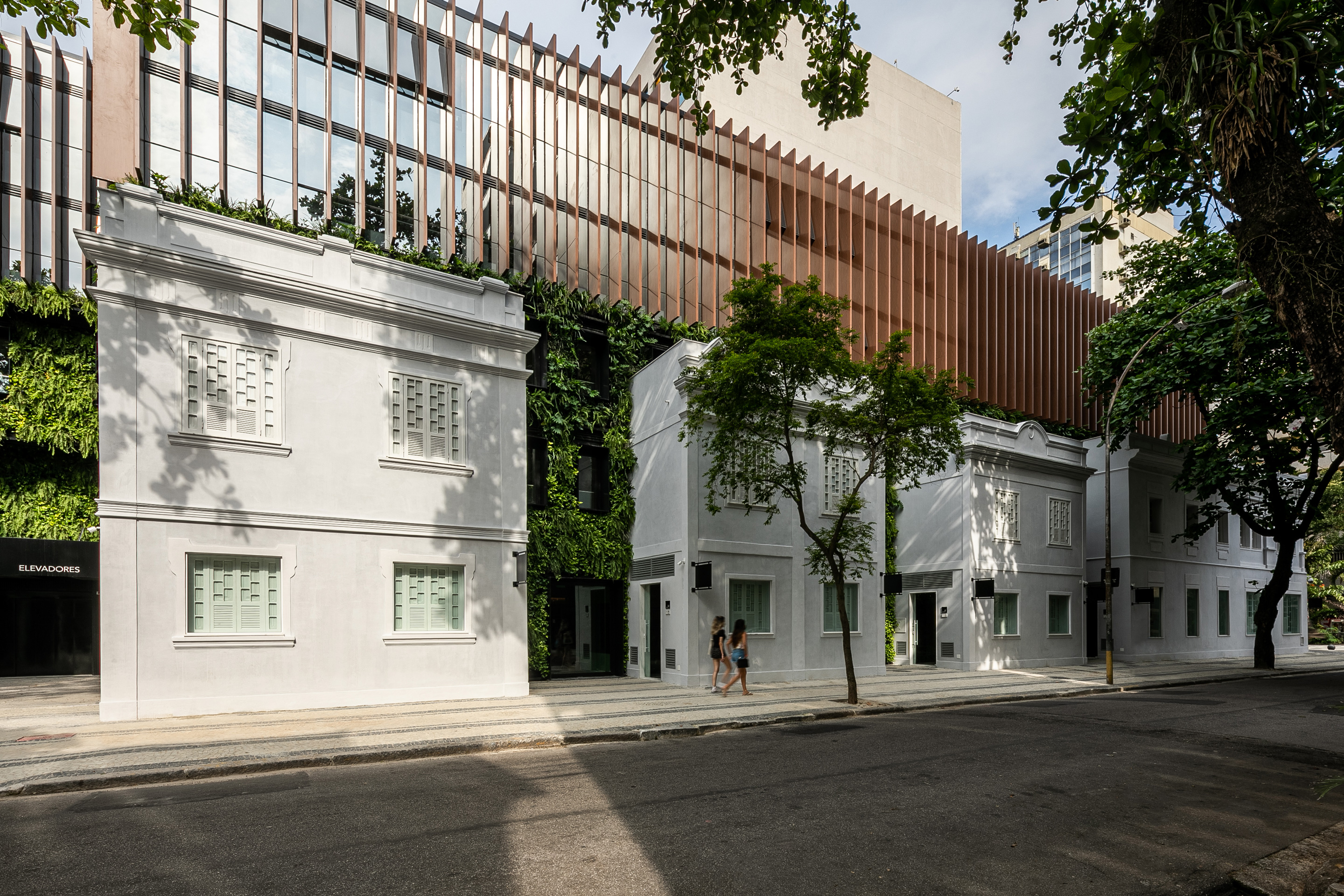
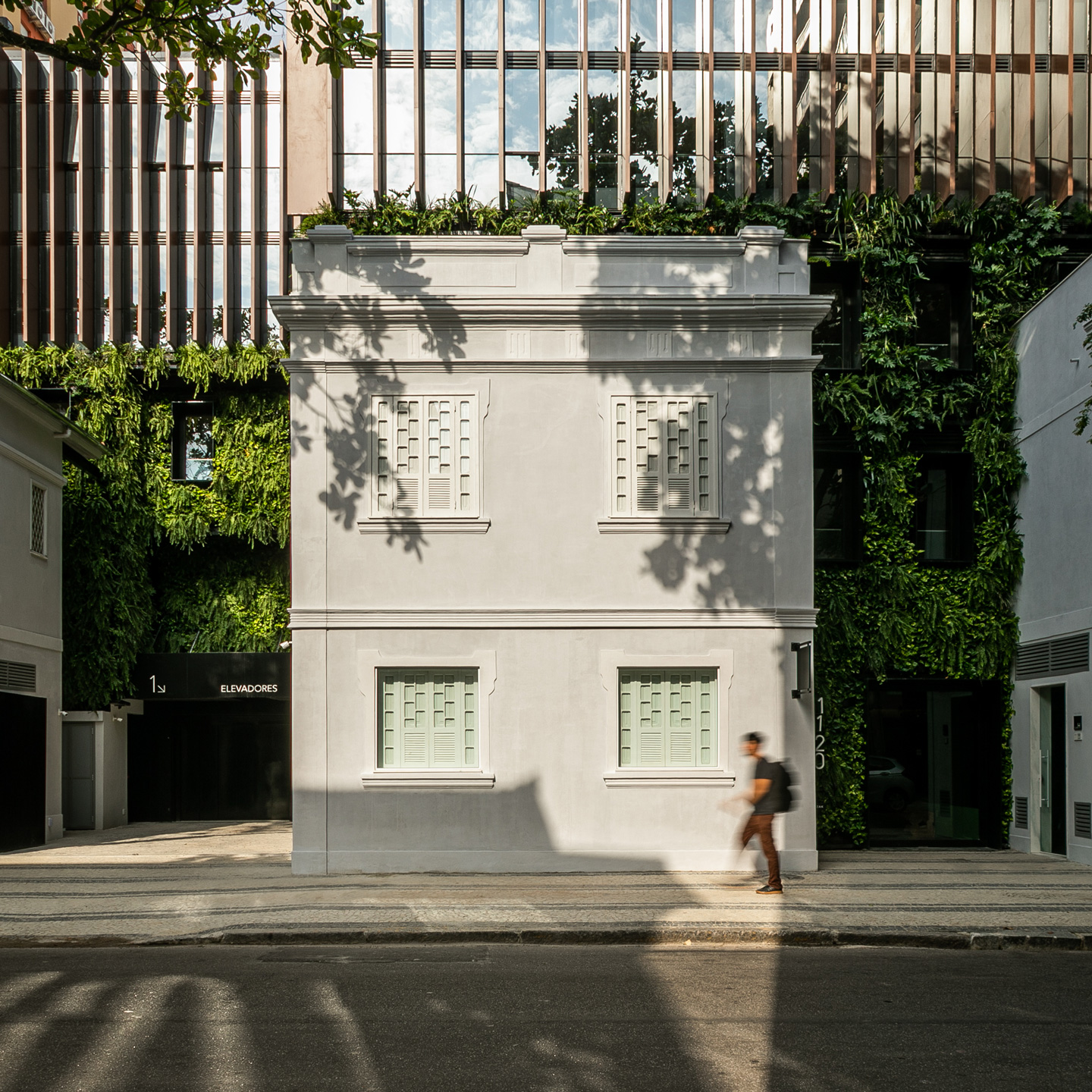
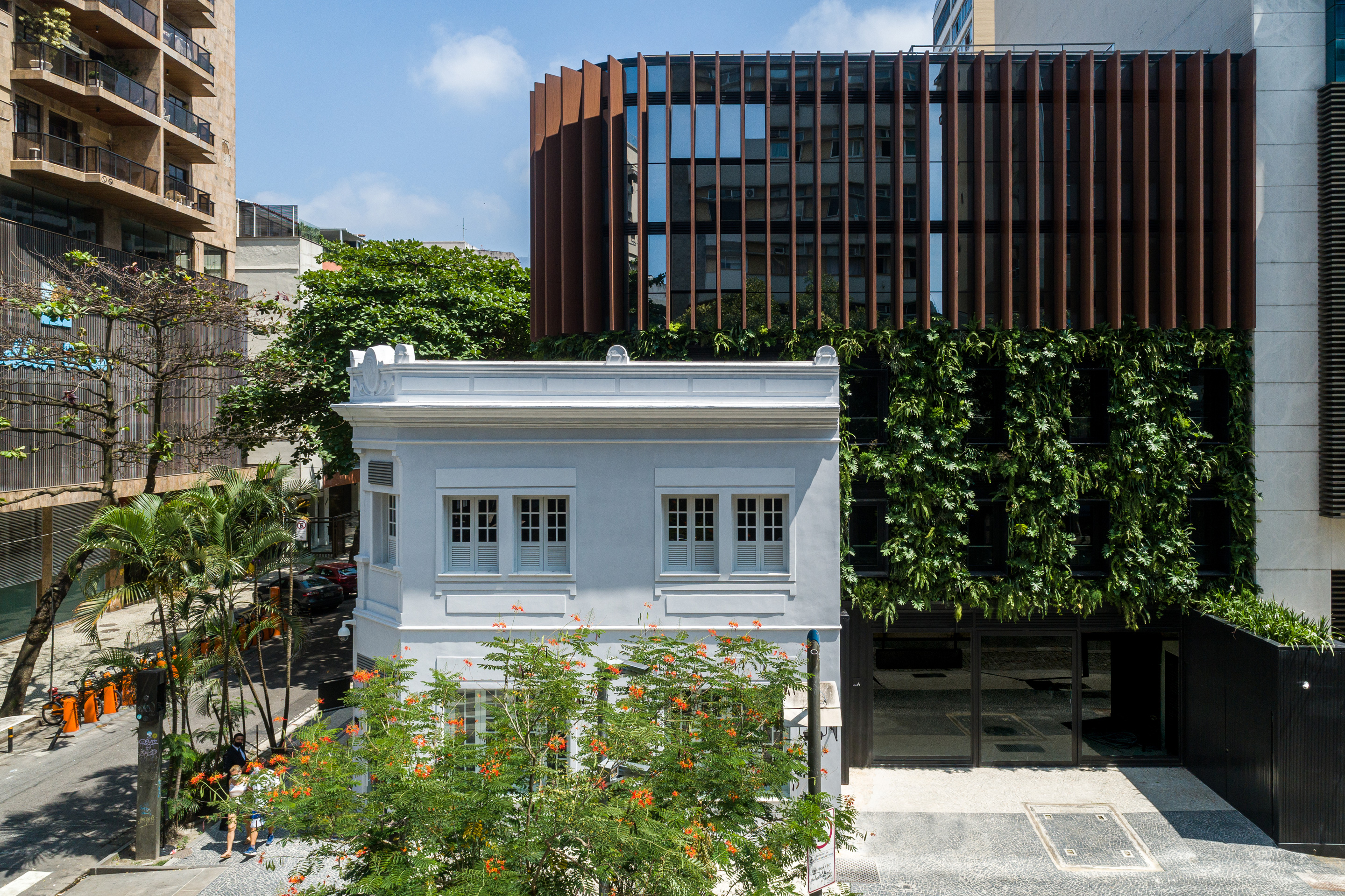
In order to proceed with the renovation of the building, and based on the latest land use and occupation legislation, we proposed erecting a new building while preserving the original façade of the former school.
The restoration project involved an intense study of the pathologies, now in an advanced stage, of the façade and subsequent recomposition of the original volumetry, obeying the shape and the construction materials as well as the technical characteristics necessary for ensuring compatibility between the original materials and the intervention.
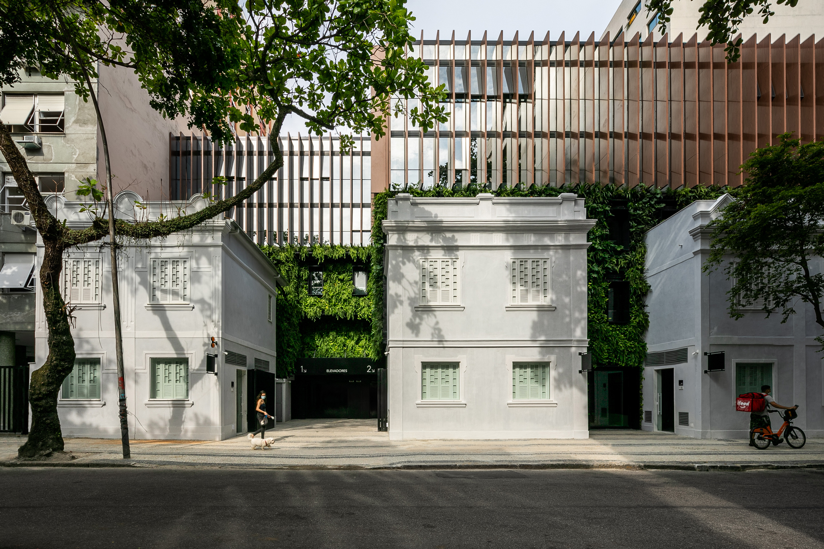
As of the façade, in a series of blocks, the passages and public accesses to the 10 stores on the ground floor were mapped out. Above, five floors are under development as office space with adaptable typologies, along with four underground levels for parking.
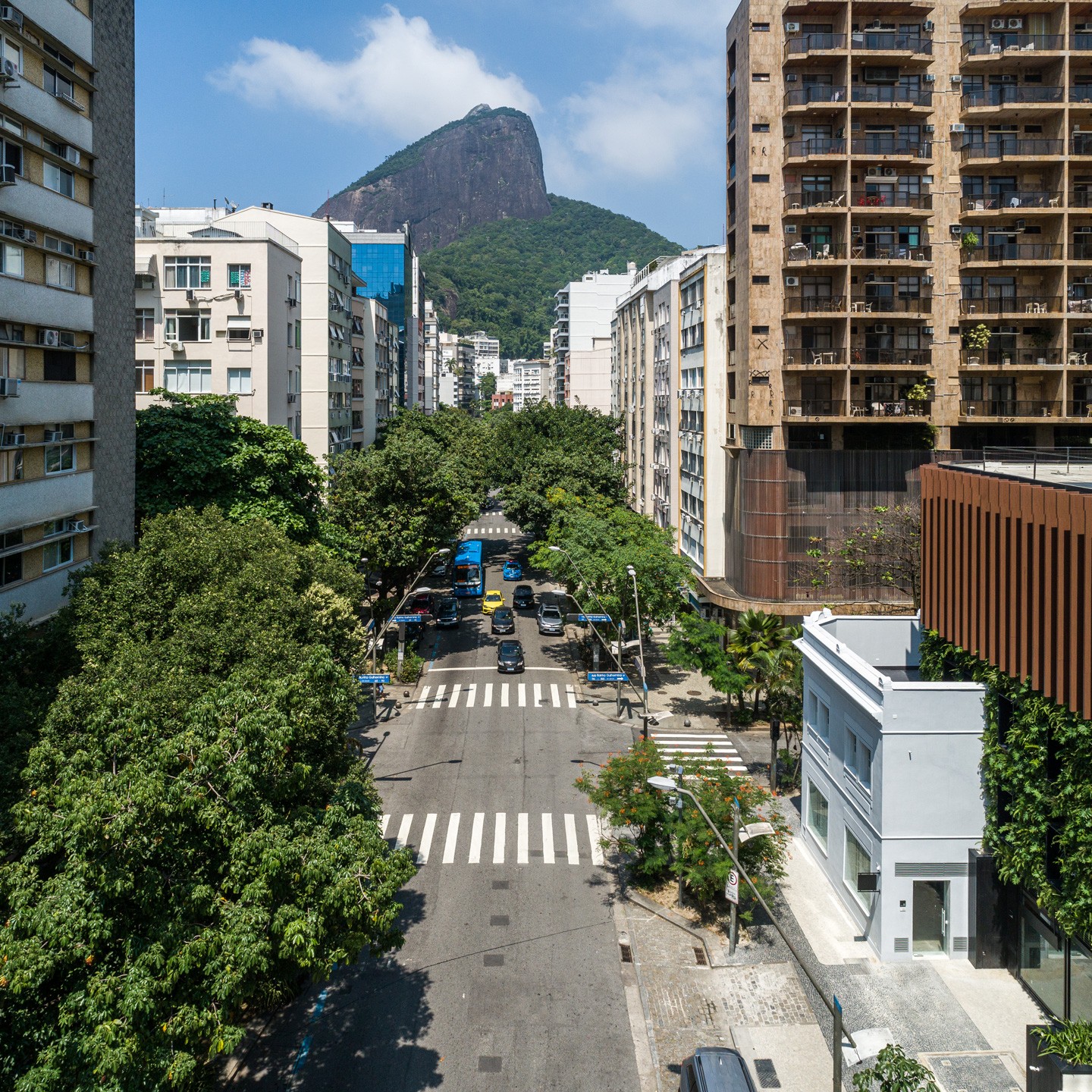
Positioned on one corner of the Leblon neighborhood’s main avenues, the lot has high visibility in a location notable for heavy pedestrian and vehicle traffic.
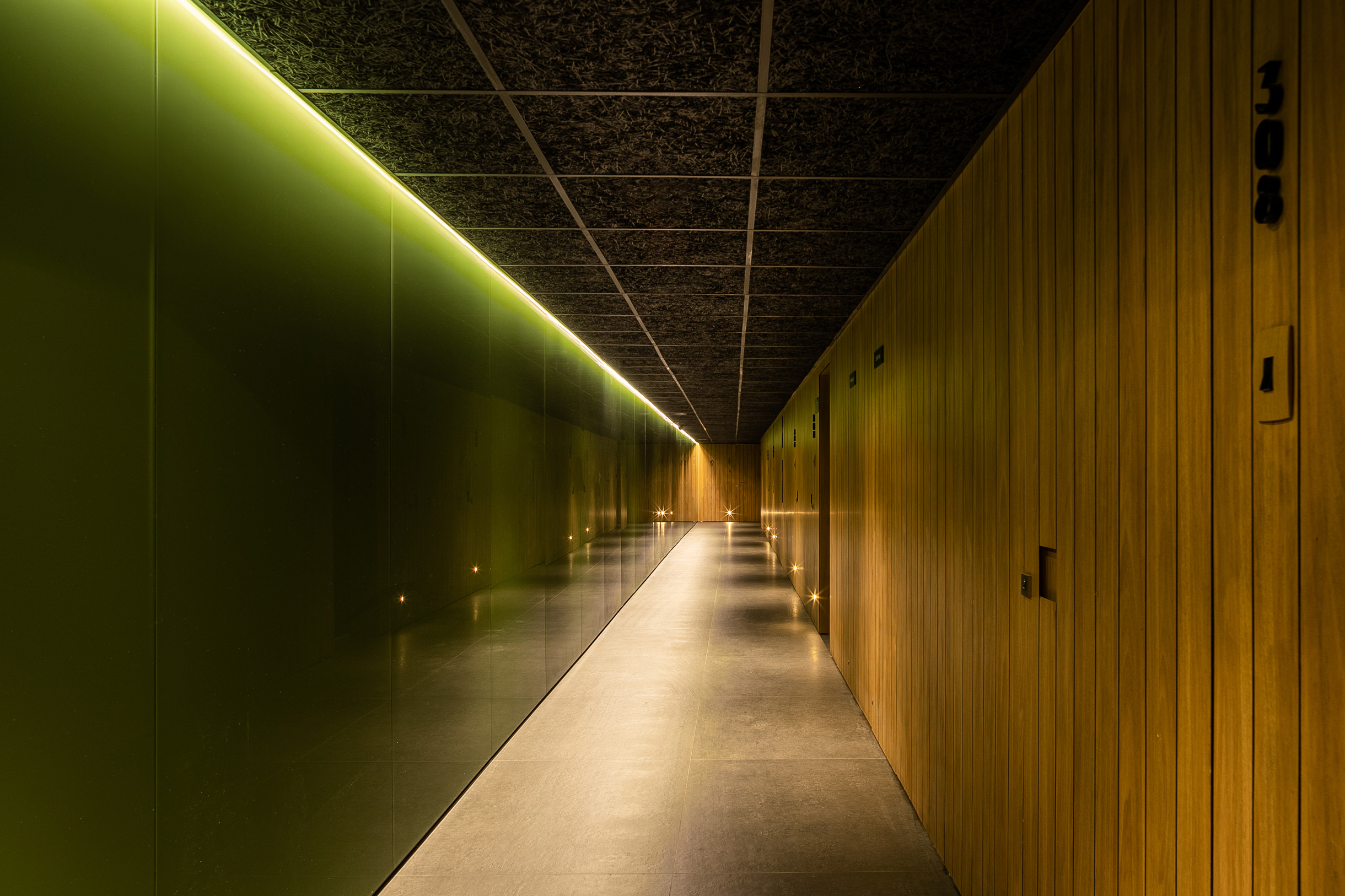
We sought to adopt a subtle architectural style that, using vertical gardens and wooden baffles, did not impose itself on the neighborhood’s emotional memory of the original Saint Patricks façade. The new building’s Architecture acts as a silent backdrop that enhances the rhythms and volumes of the older one.
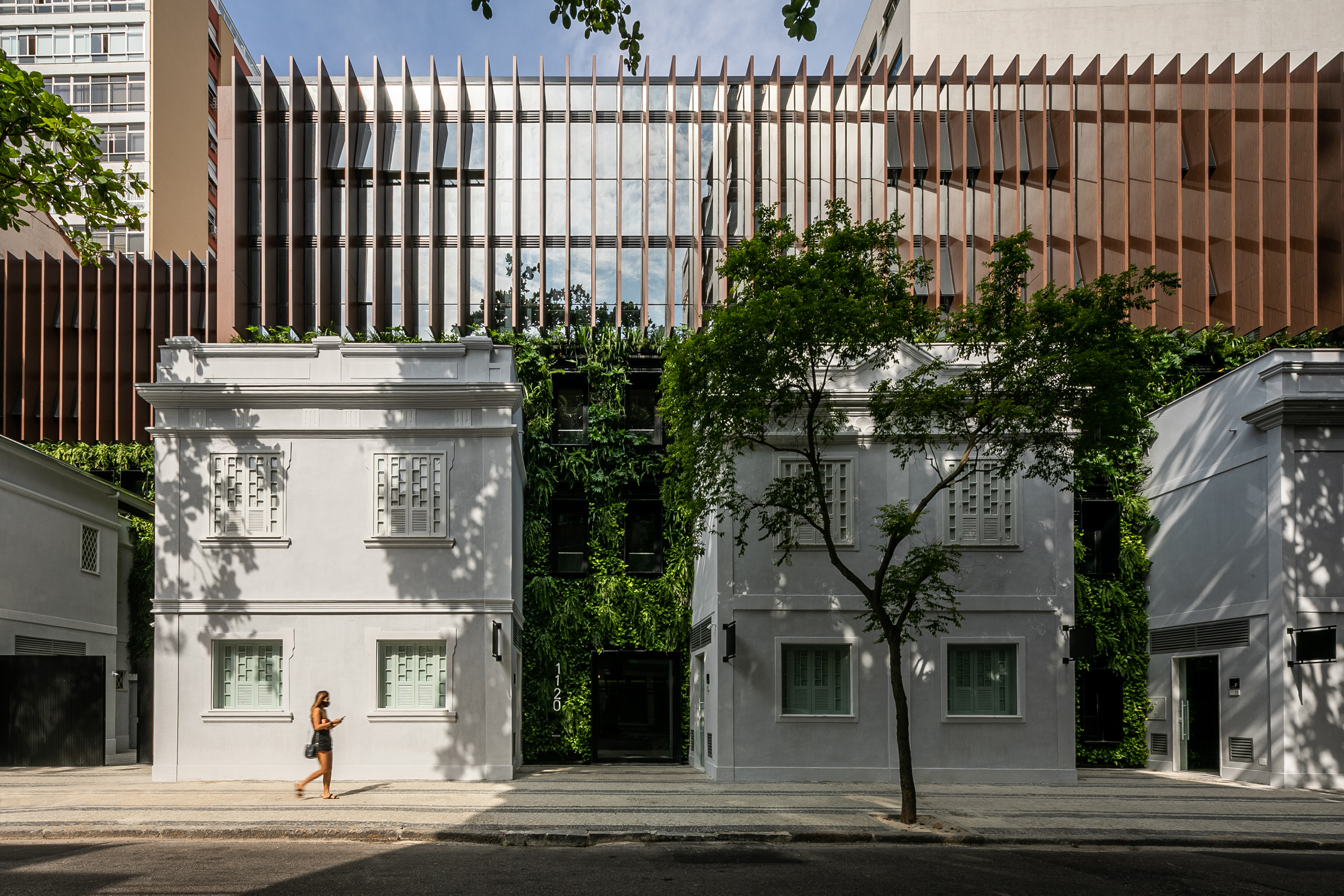
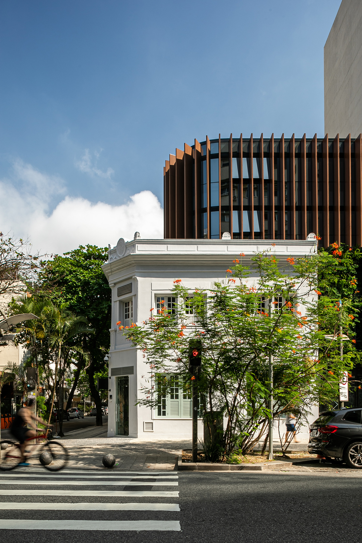
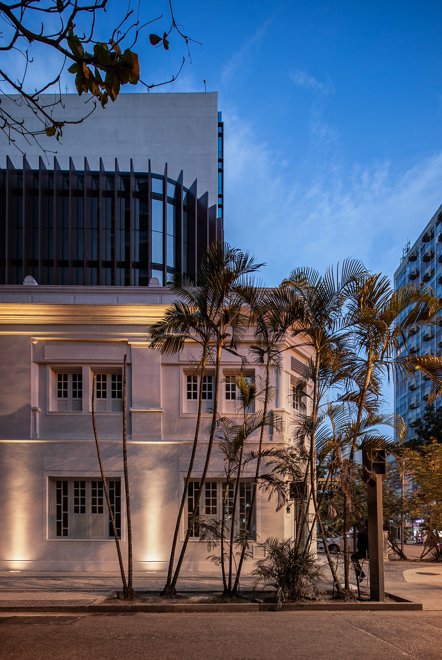
Added to this intention is the decision of rounding off and moving back the corners of the baffled volume, reducing the visual impact and to some extent reinterpreting the volumetry of the neighborhood’s buildings, dating from the 1950s.
